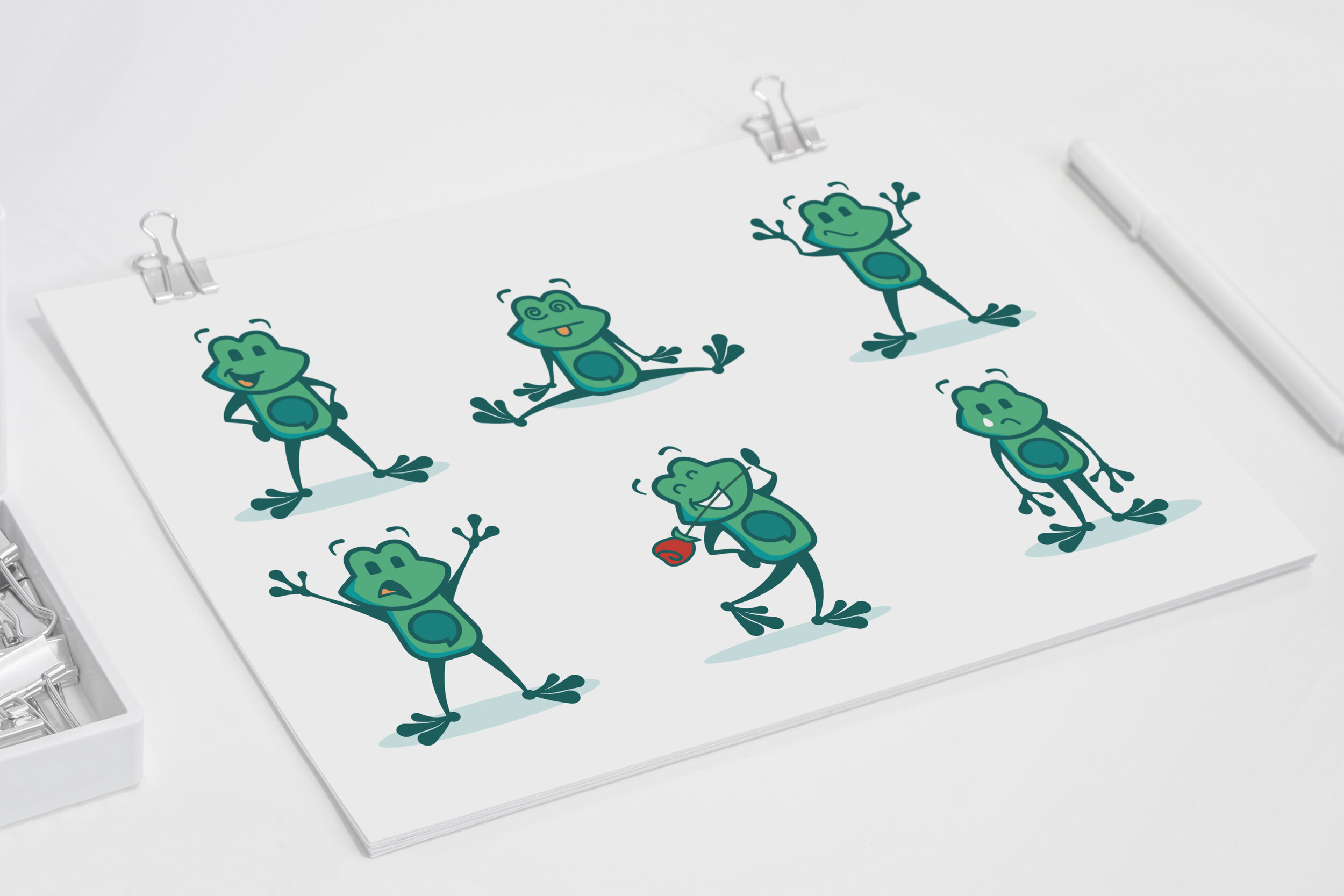
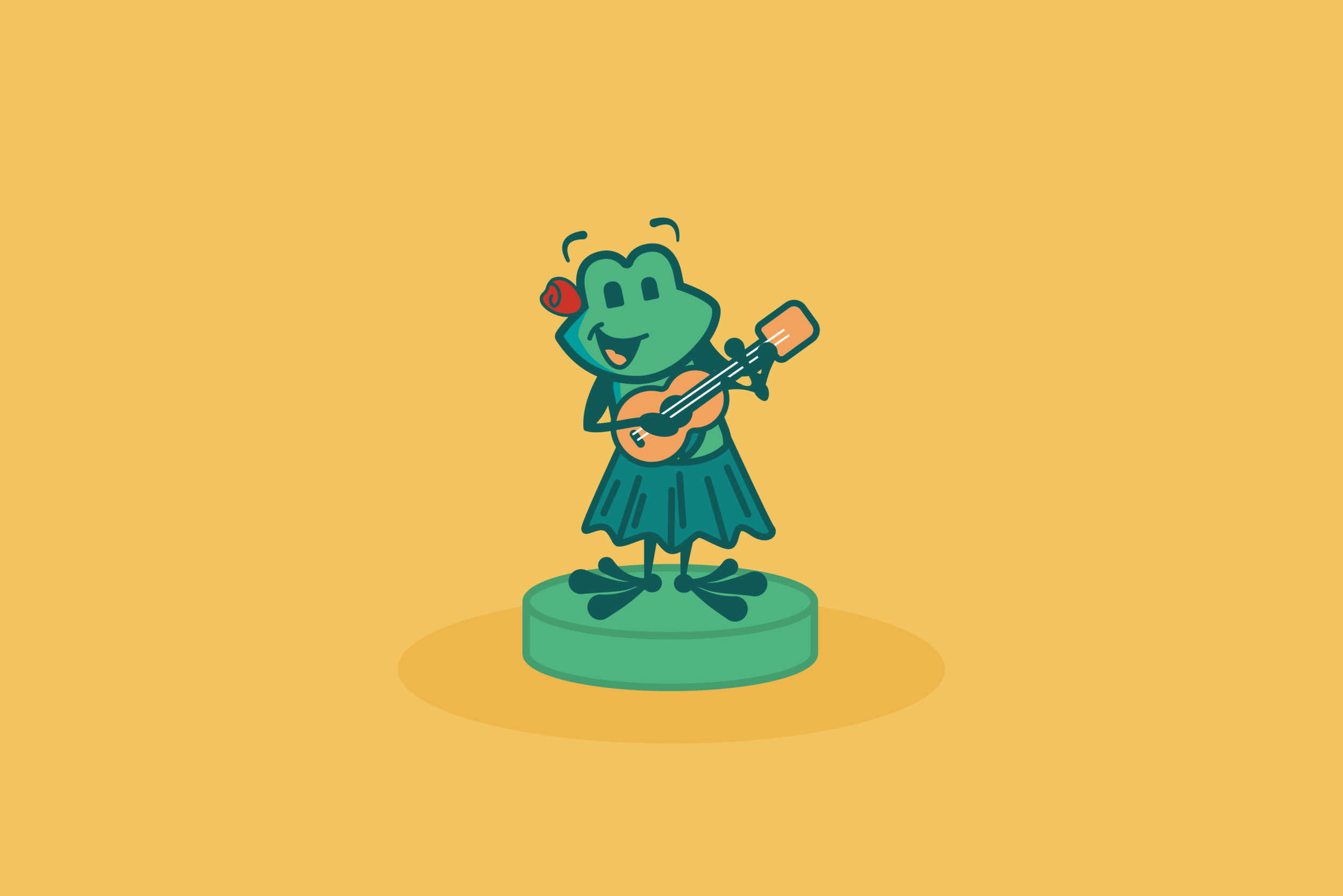
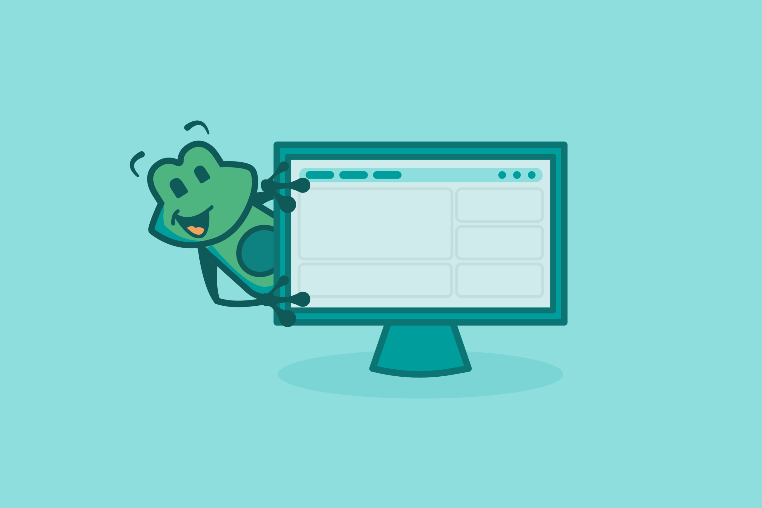

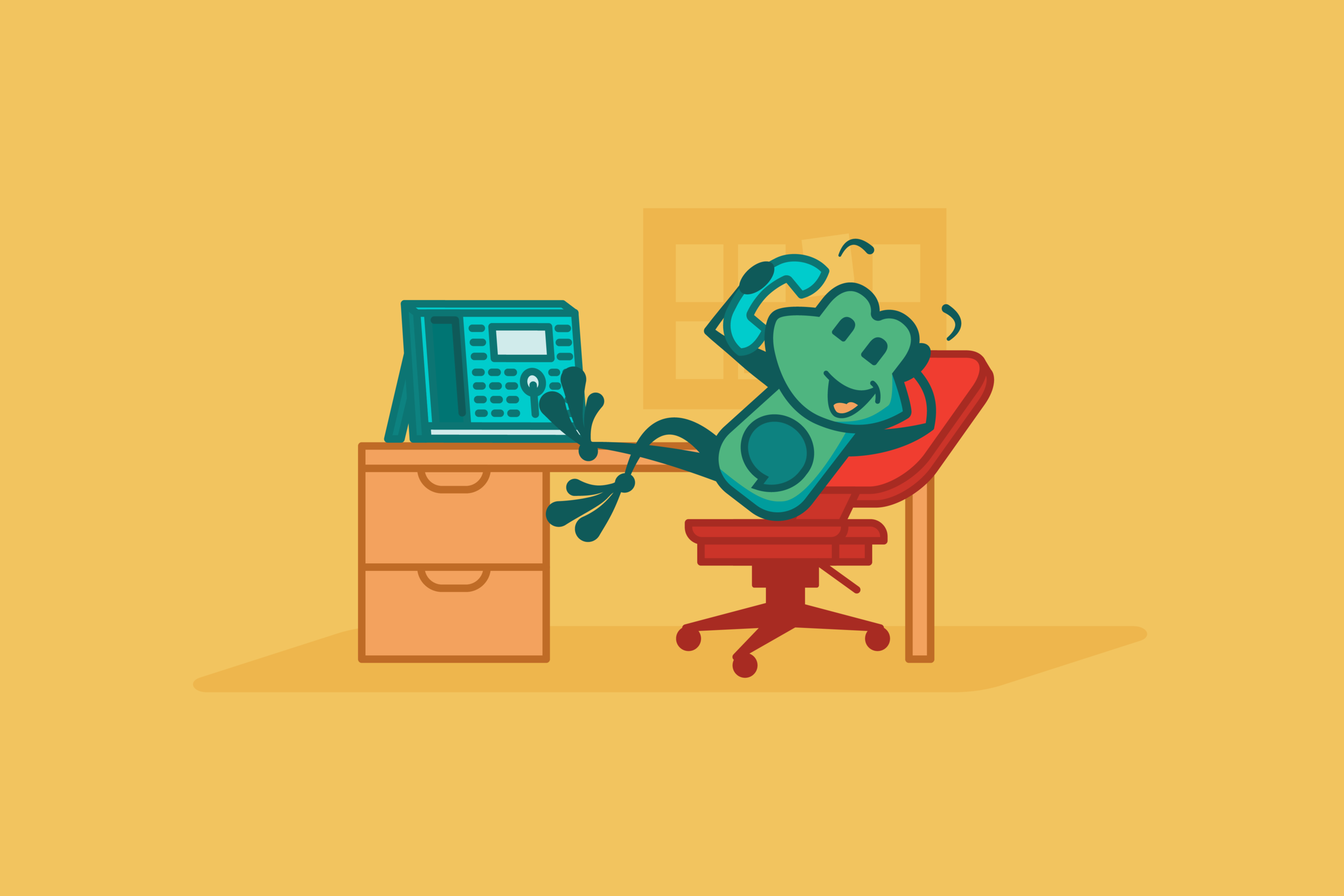
tango / freepbx
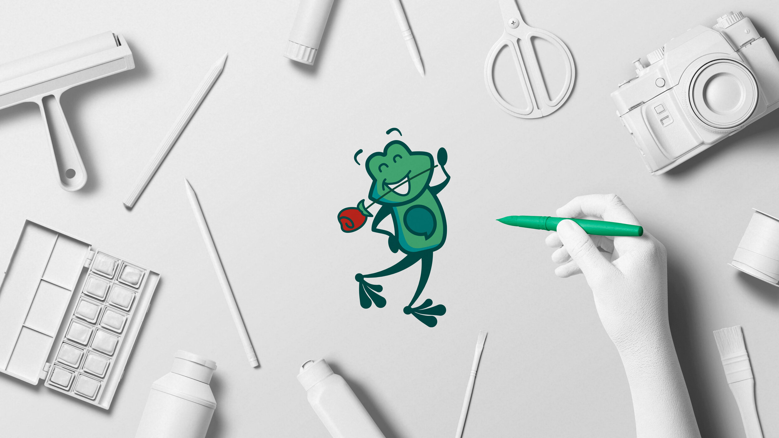
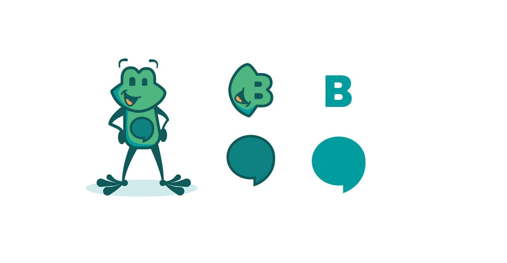
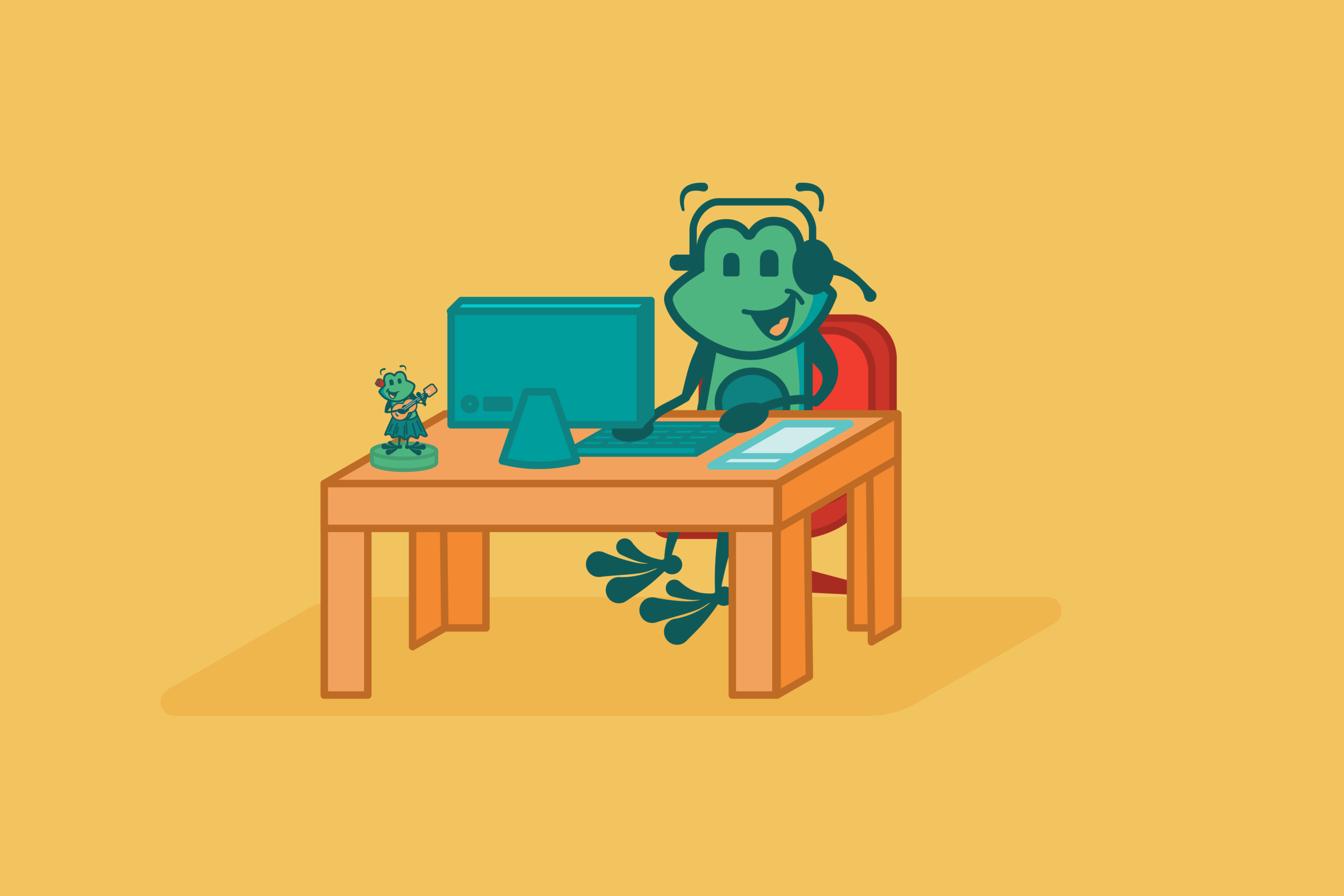
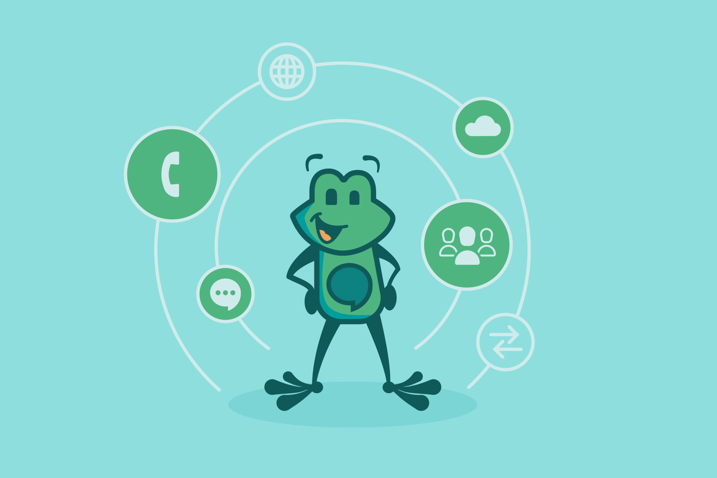
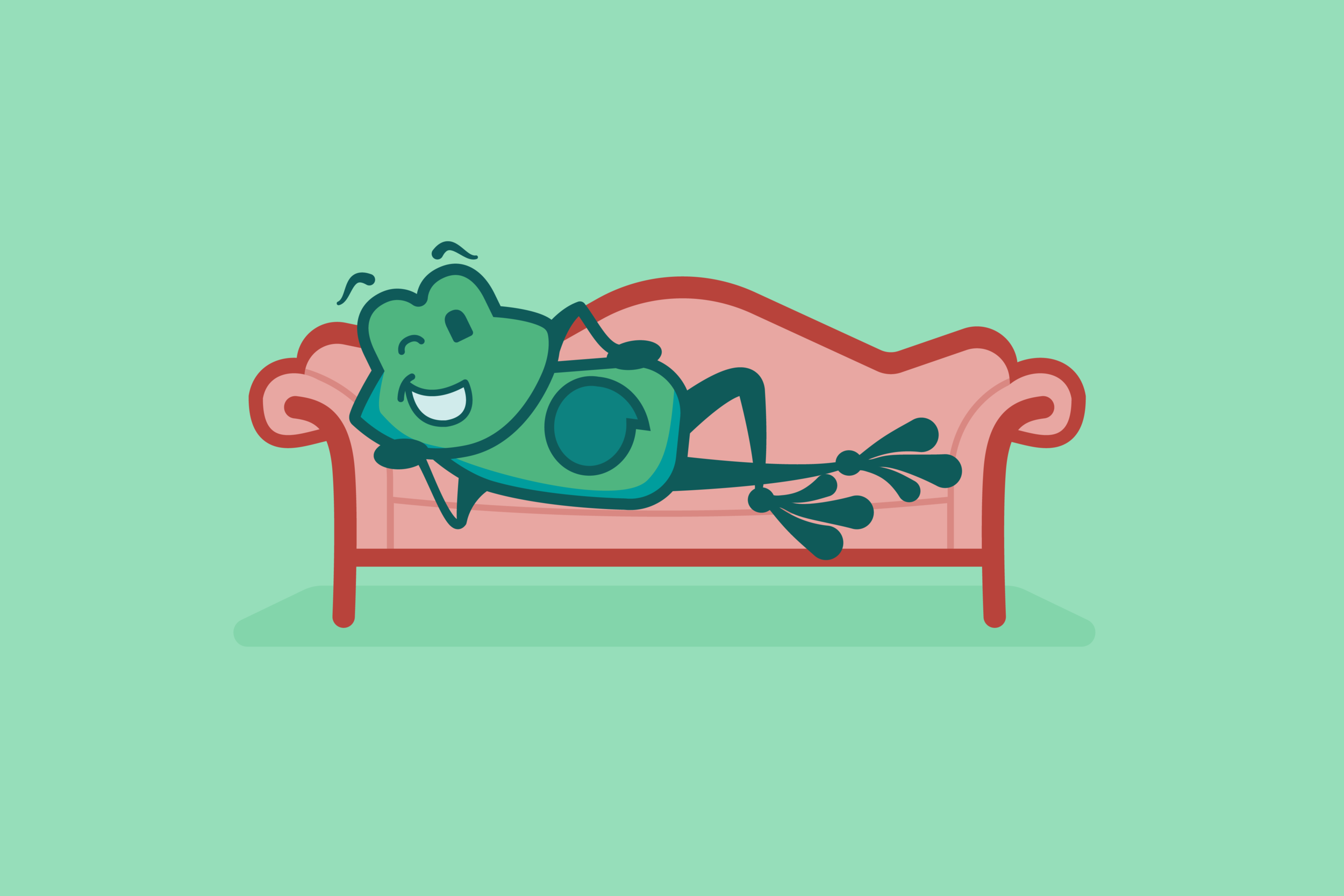
The folks over at Sangoma acquired the product FreePBX (a web-based open source GUI for communication devices) and realized that the logo used clipart for the main mascot, Tango. They wanted to not only redesign the logo to be more modern and reflective of the product, but also completely unique so that they could have more control over how Tango was being used and presented to the public (the number of times they saw the same clipart frog being used for different products was starting to become depressing.)

kit / asterisk
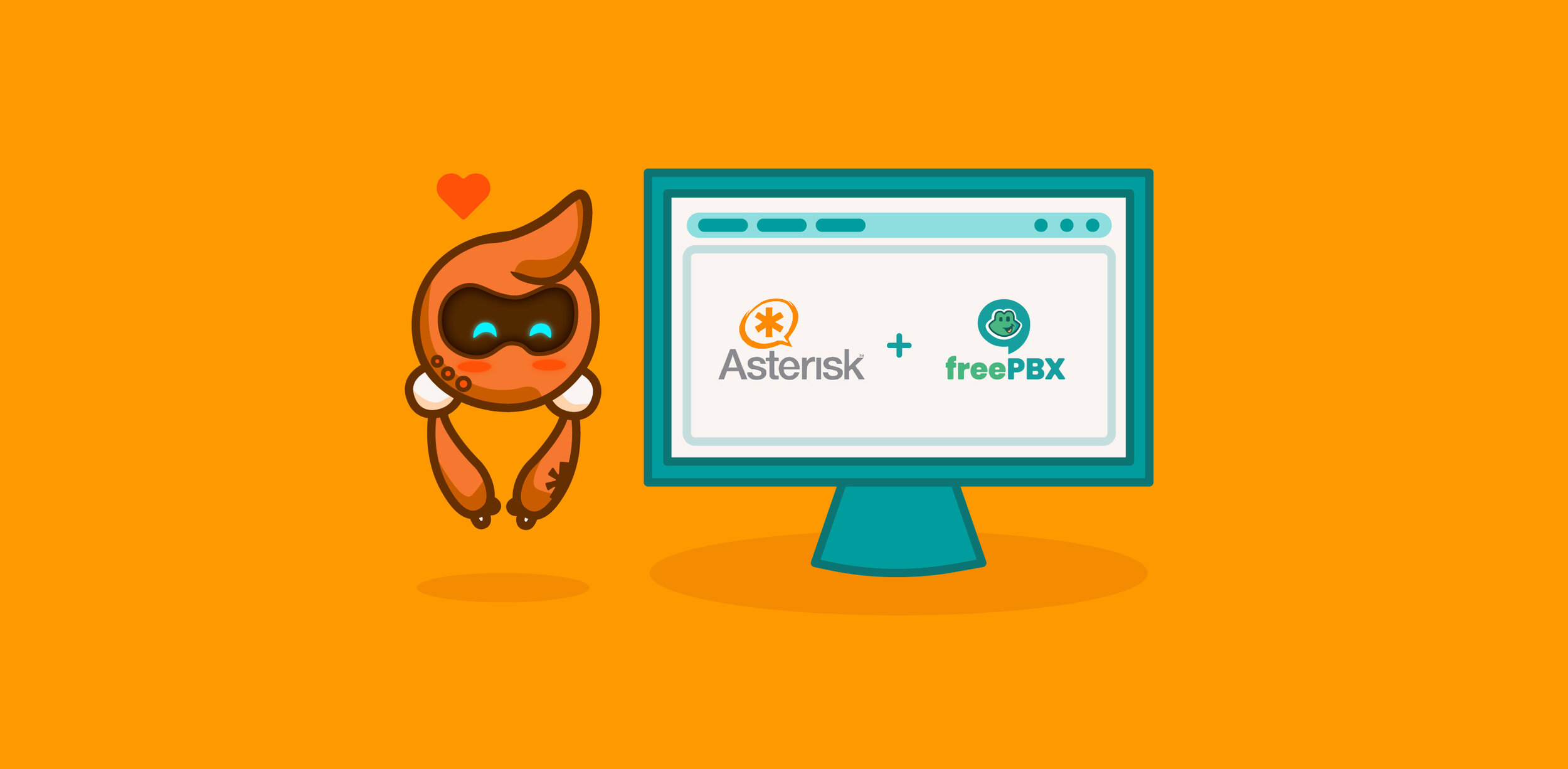
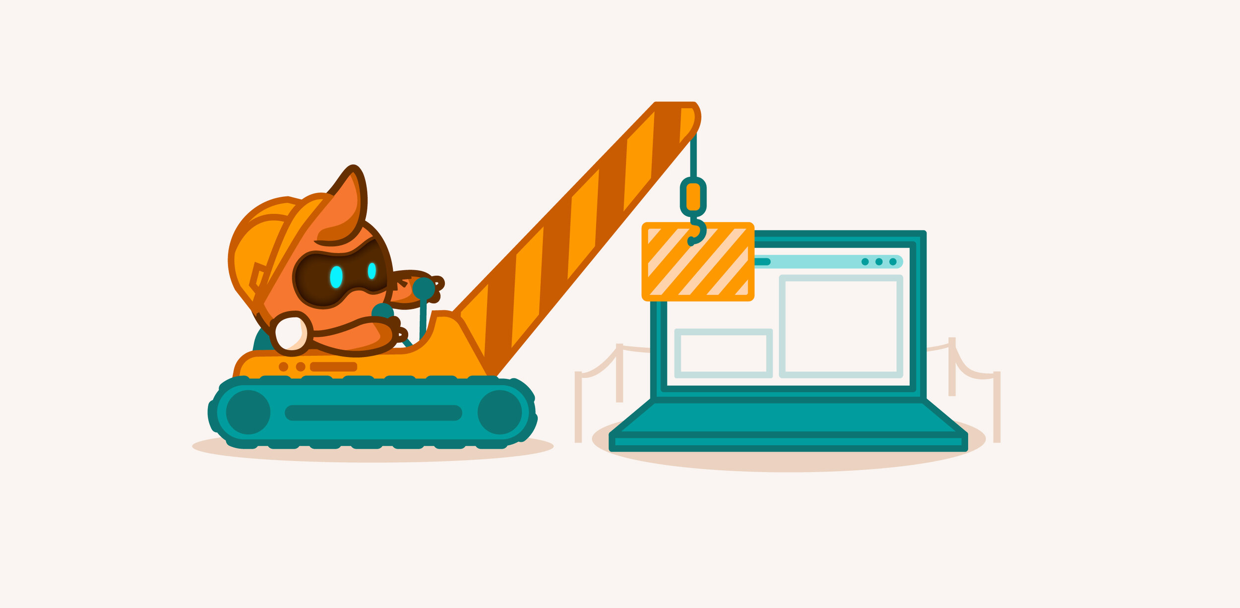
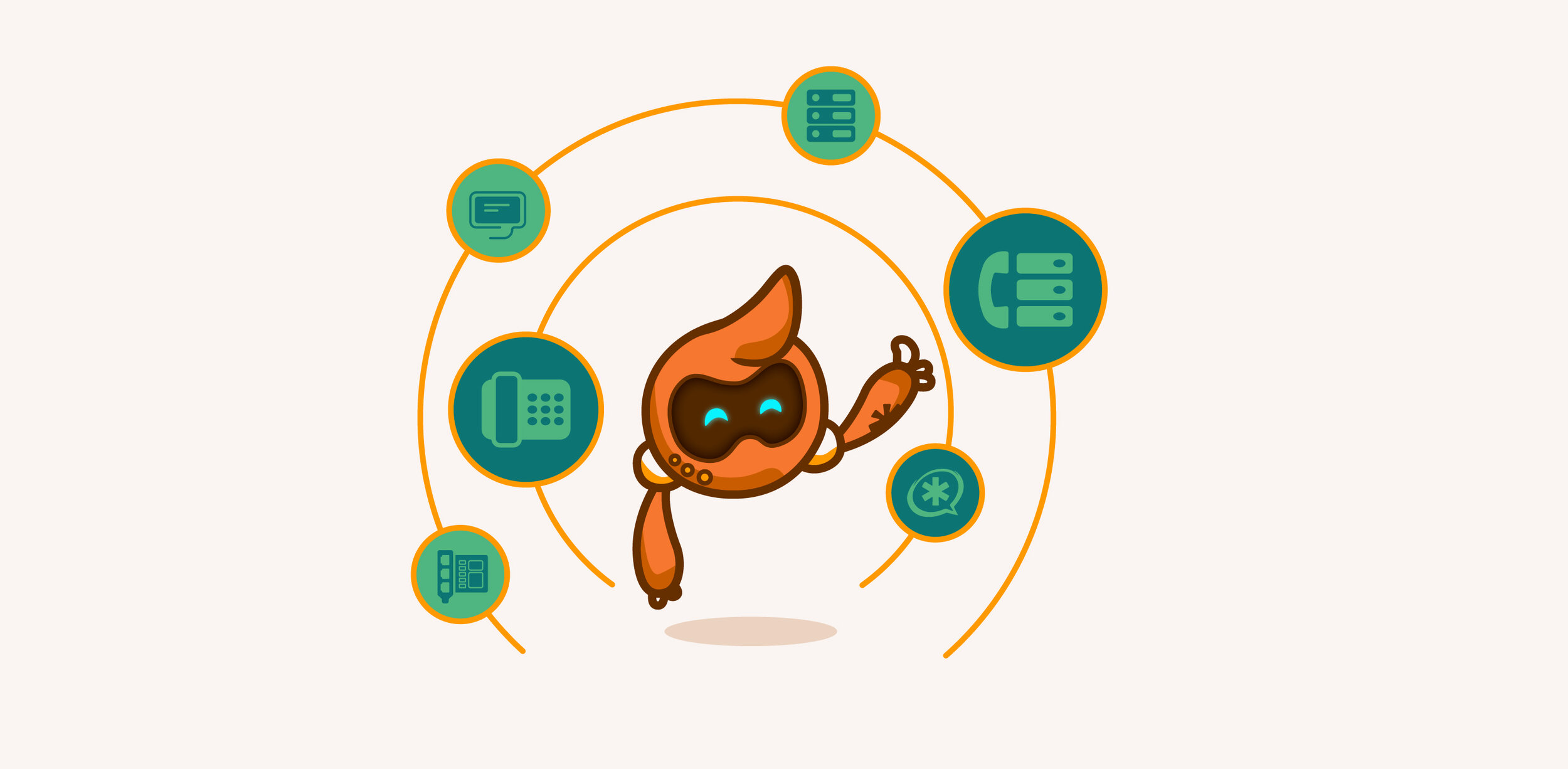
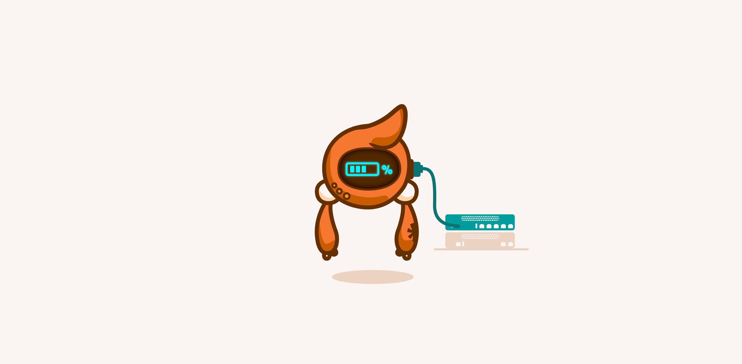
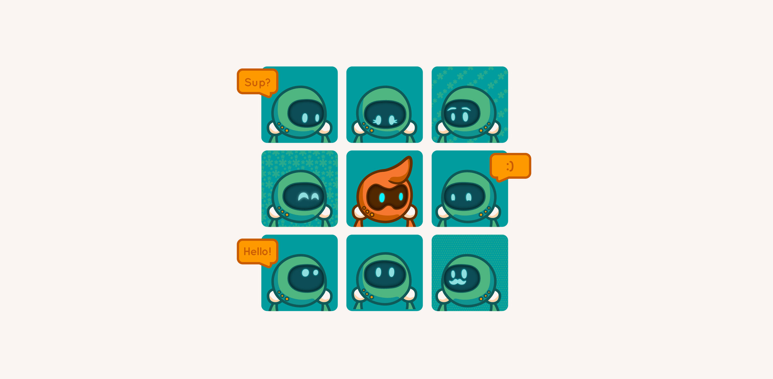
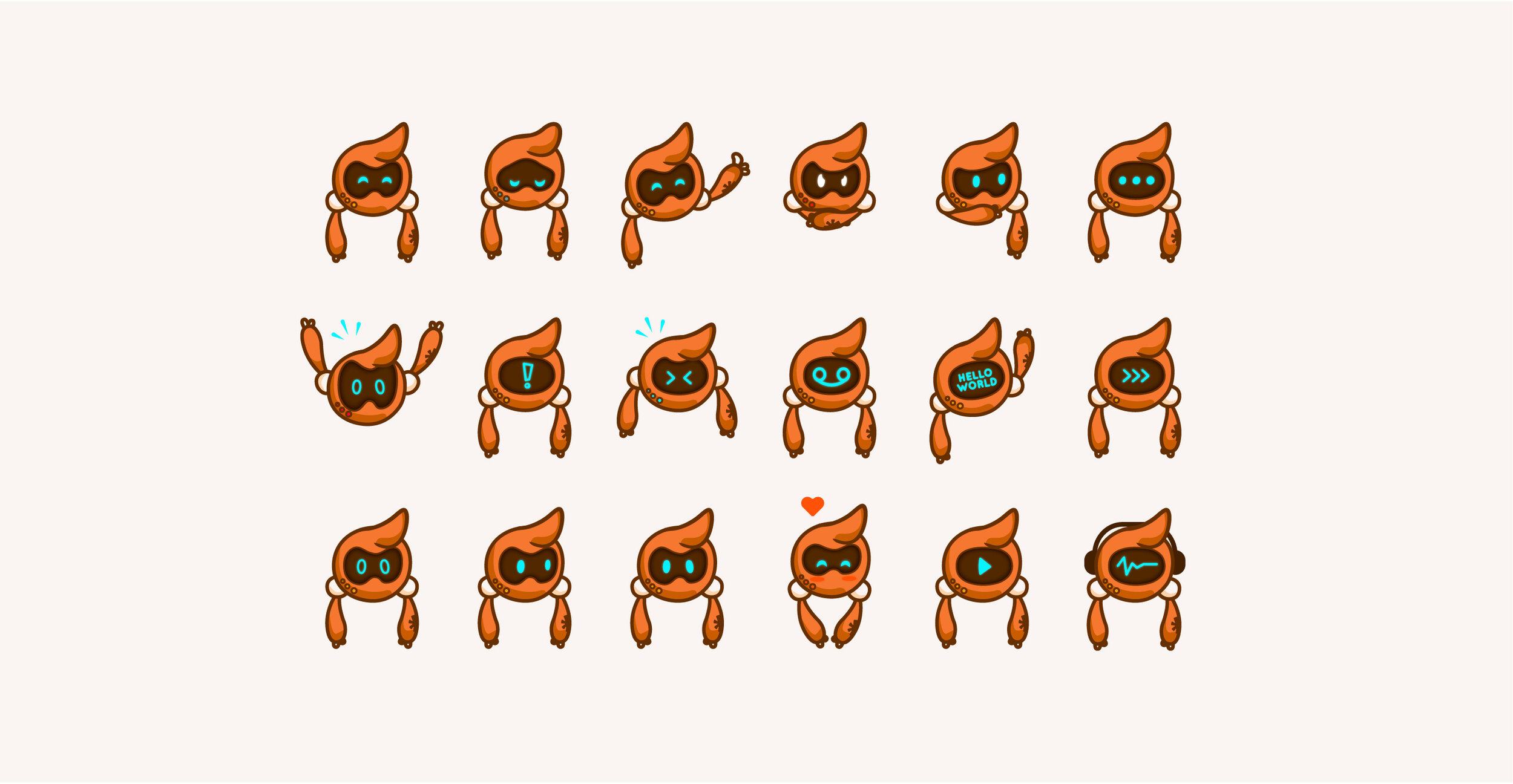
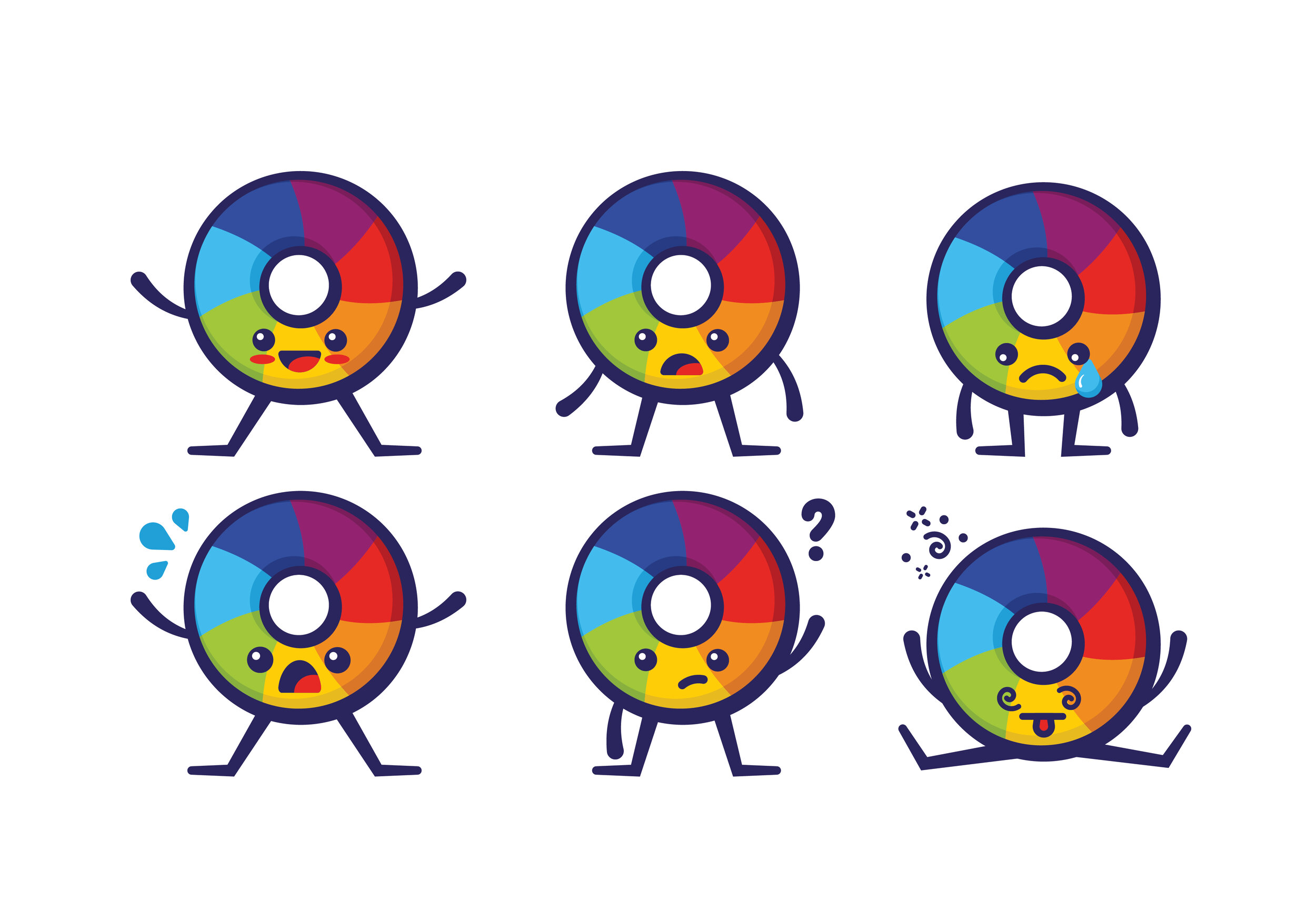
After the successful launch of Tango for FreePBX, another team over at Sangoma wanted to get in on the character design action. Thus, Kit was born. The exciting part about this project was that Asterisk didn’t have a mascot to work with. So instead I was able to delve deep into what makes the company so unique, and develop a character purely from scratch for them (and name him!.) His body shape is a nod to the Asterisk logo, and instead of relying on a mouth or eyebrows to express his emotions, all of Kit’s personality comes from his face screen. His name, Kit, is a reference to the customizable nature of the Asterisk communications system.


professor icinghower / altmetric
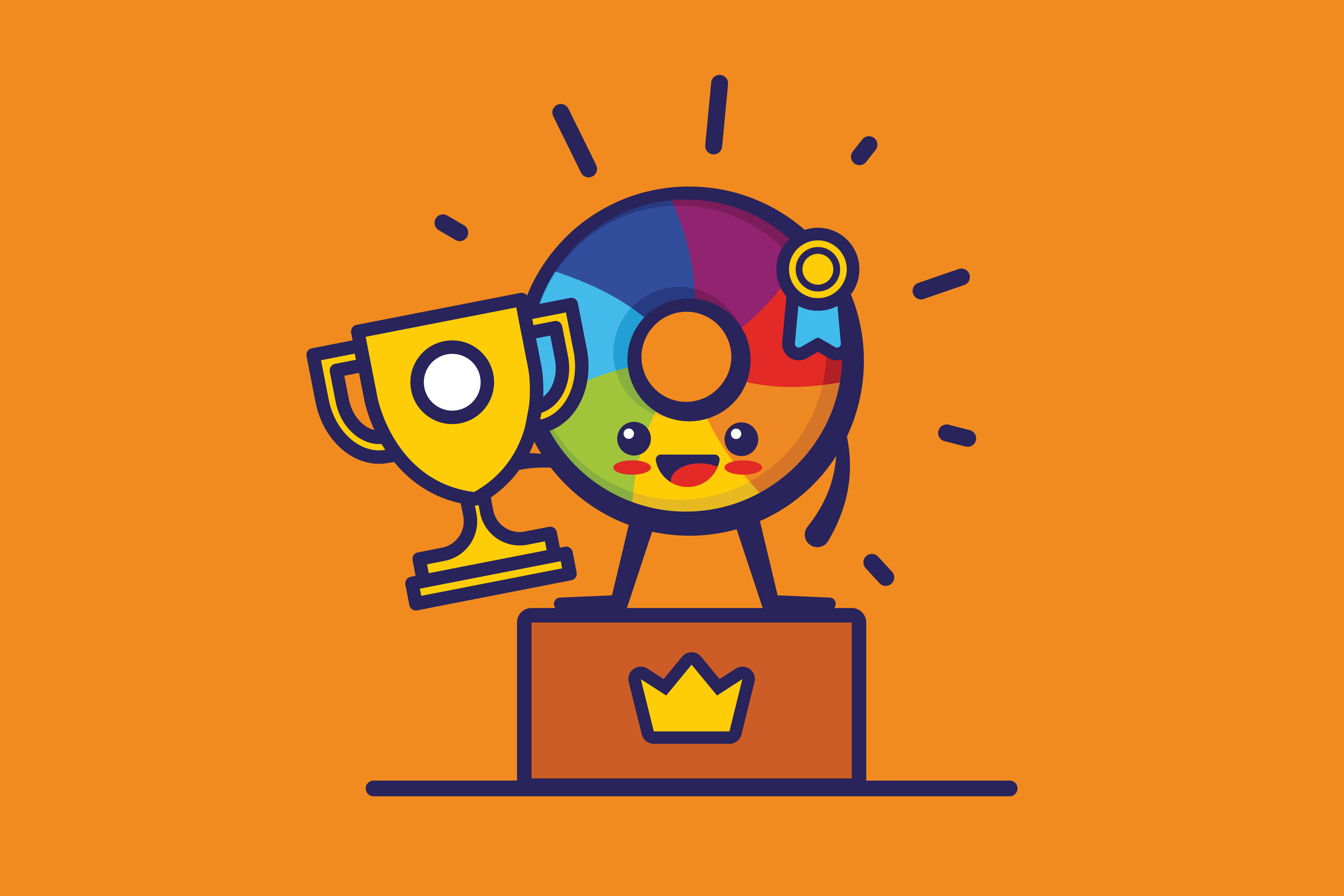
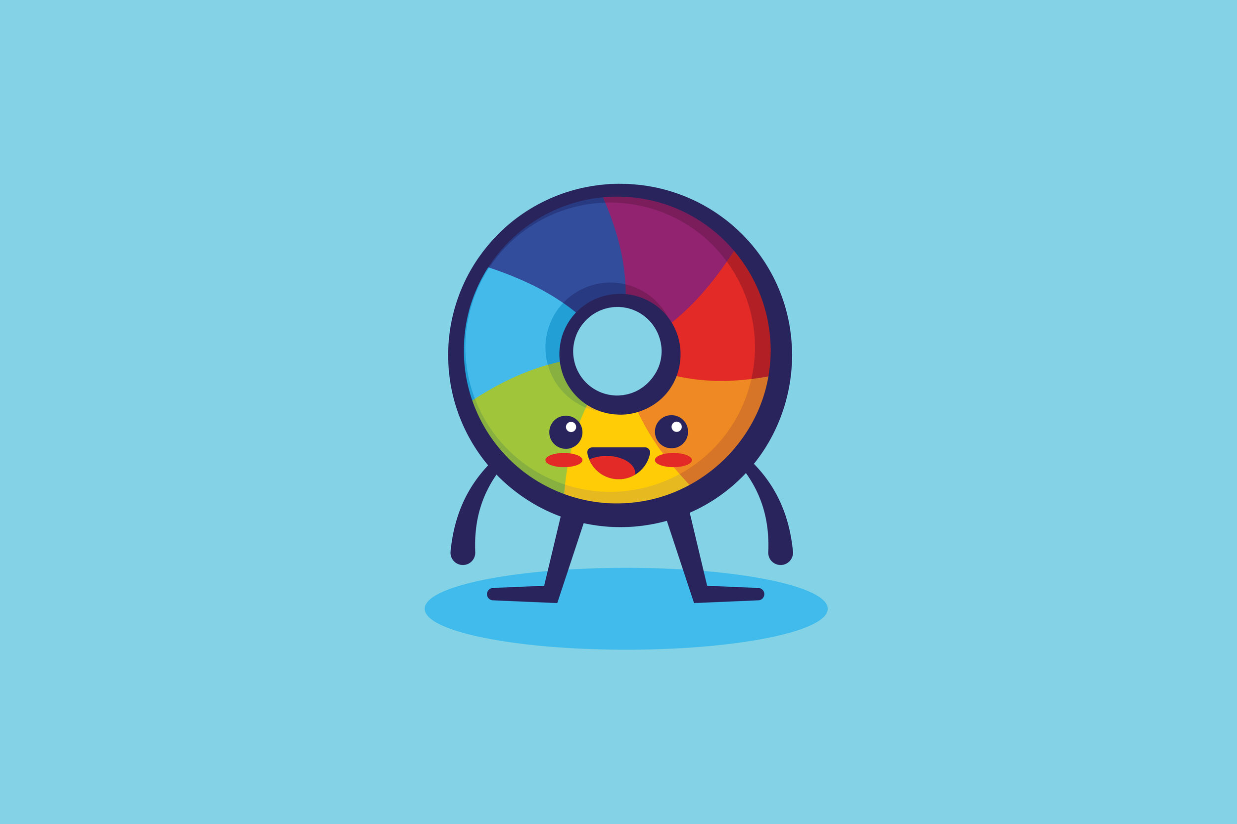
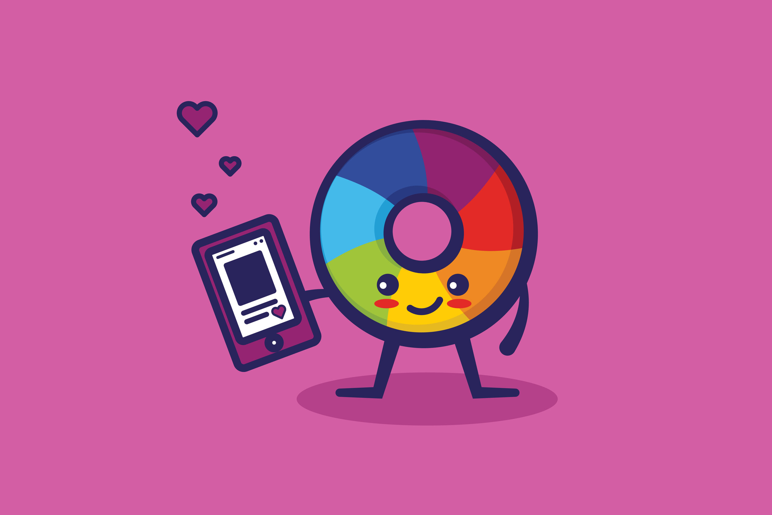
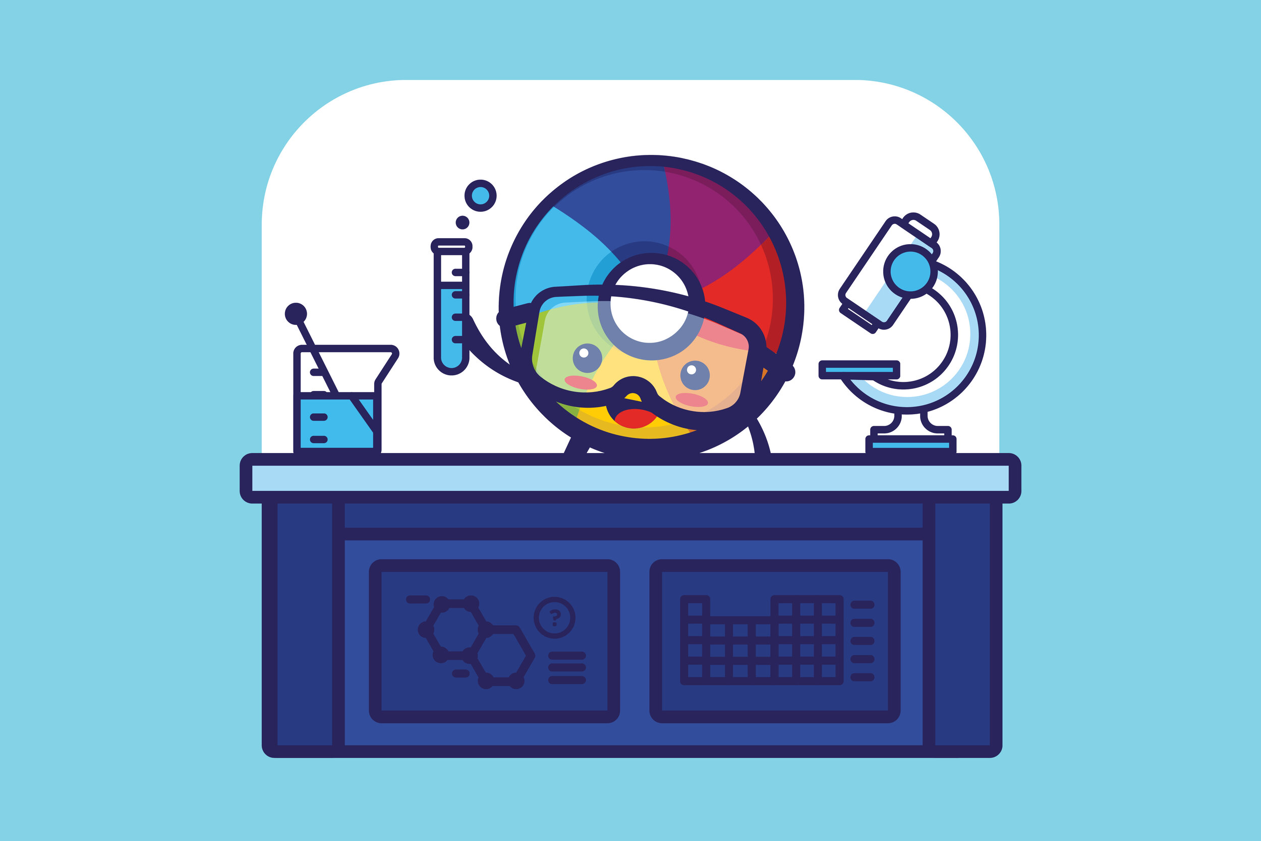
Professor Icinghower, AltMetric’s mascot, was in need of a refresh. I wanted to make sure I paid homage to the original design, and made him modern and adaptable enough so that he could be used in various scenarios.

cass gilbert /us chamber of commerce
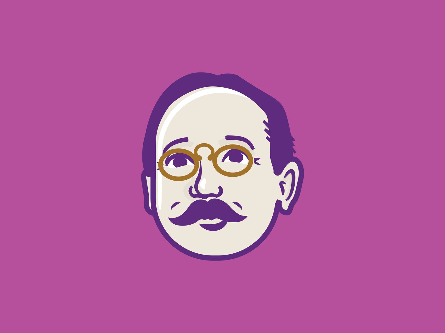
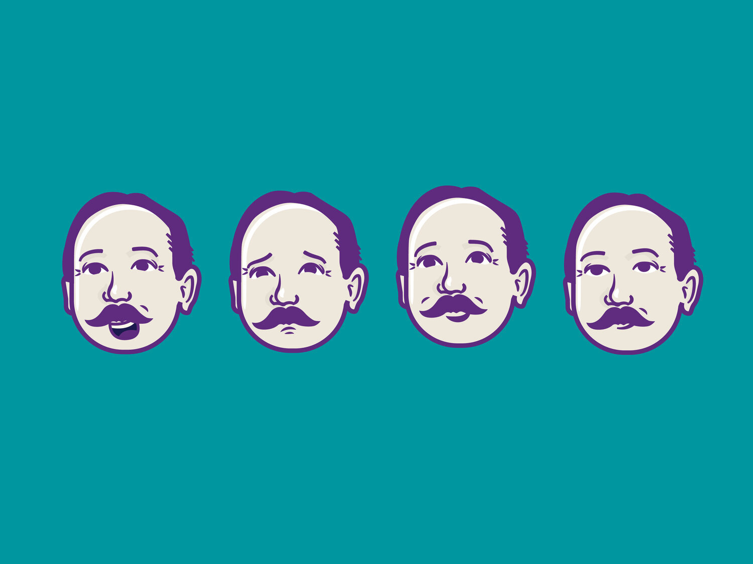
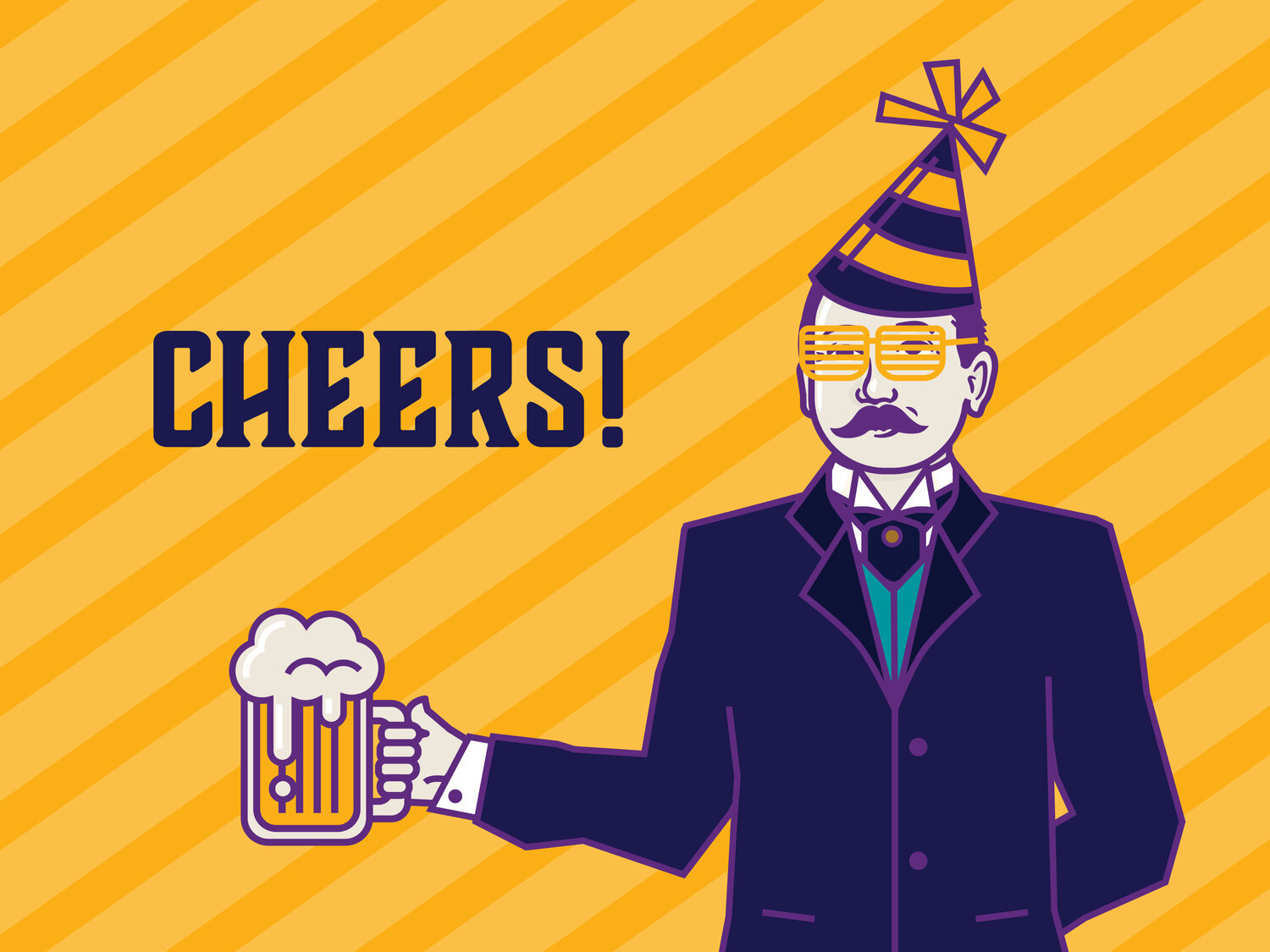
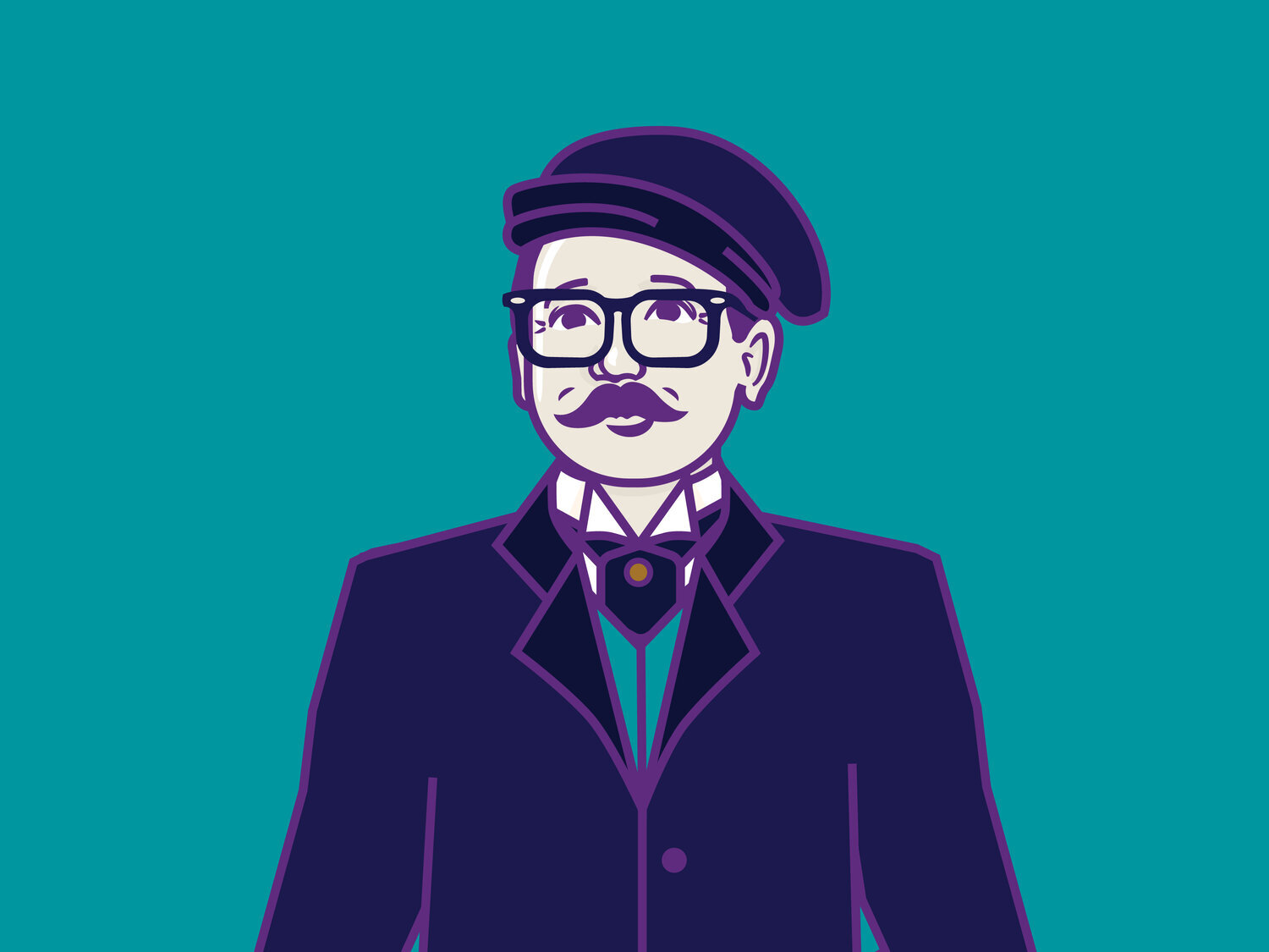
The US Chamber of Commerce was gearing up to do a series of renovations to its headquarters in downtown DC. In order to pay homage to the building’s architect, Cass Gilbert, they reached out for me to create him as a vector illustration with a set of “paper doll” like accessories that they could use to customize him as needed. They used these illustrations of Cass to help create unique marketing messaging for both internal staff and visitors to the building. Who better than the original architect to serve as the messaging’s spokesperson.
dusty /handmade with ashley
Handmade with Ashley is a one-person small business woodshop, specializing in pop and geek culture. She approached me asking for a logo to capture her whimsical, playful style, which resulted in the creation of Dusty, her beaver mascot. Armed with Dusty stickers, her brand now resonates with her target audience, both in person and online.
/grumpy duck
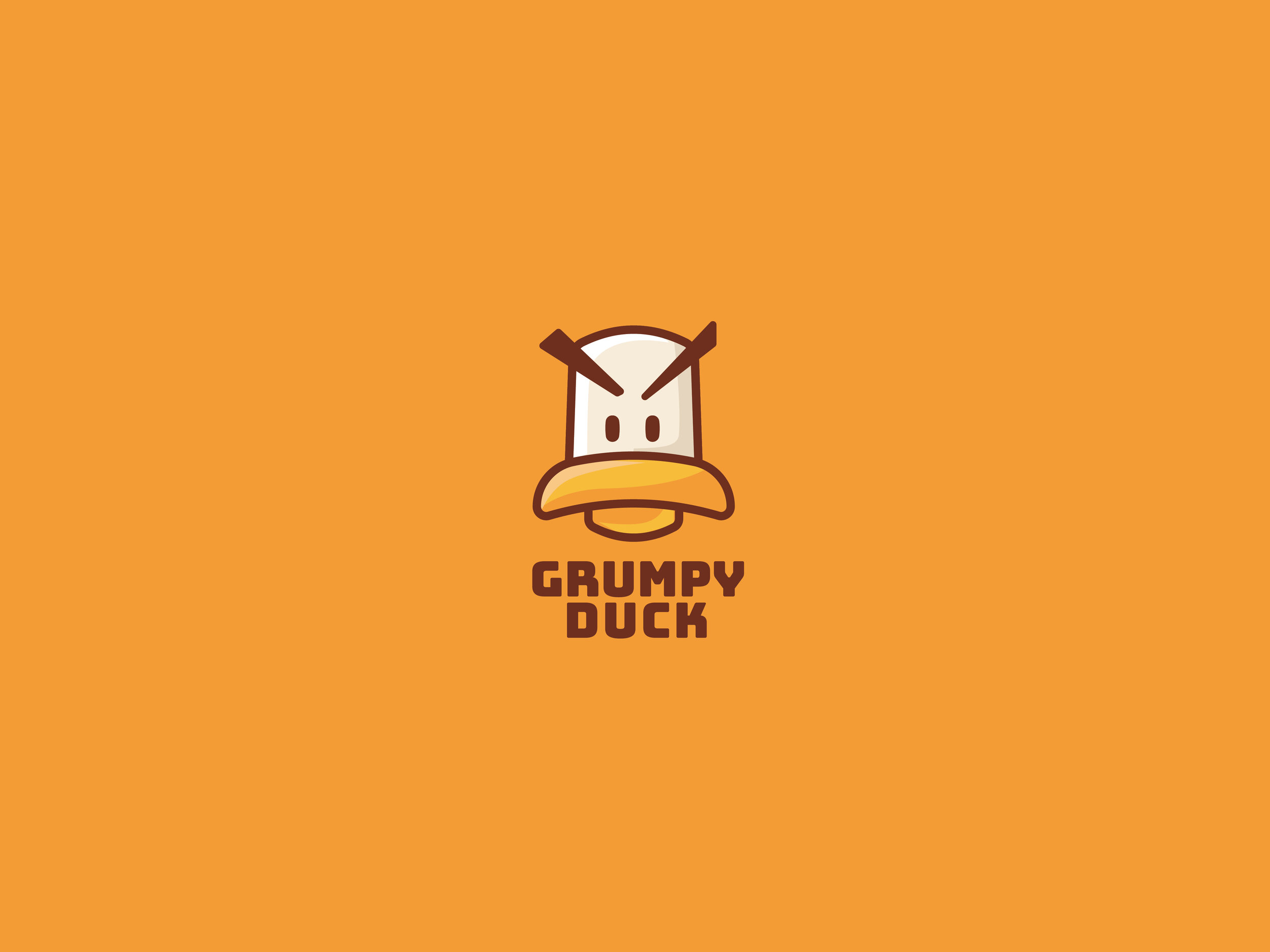
Made for an Etsy shop, Grumpy Duck offers a unique spin on the cutesy animal logos that populate the site. Not that there’s anything wrong with cute mascots! Heck, I’m a sucker for them myself. But in order to reach an untapped audience who isn’t as drawn to the kawaii as the rest of us, Grumpy Duck decided to go against the current with a less “cheerful” mascot.
/nagbot
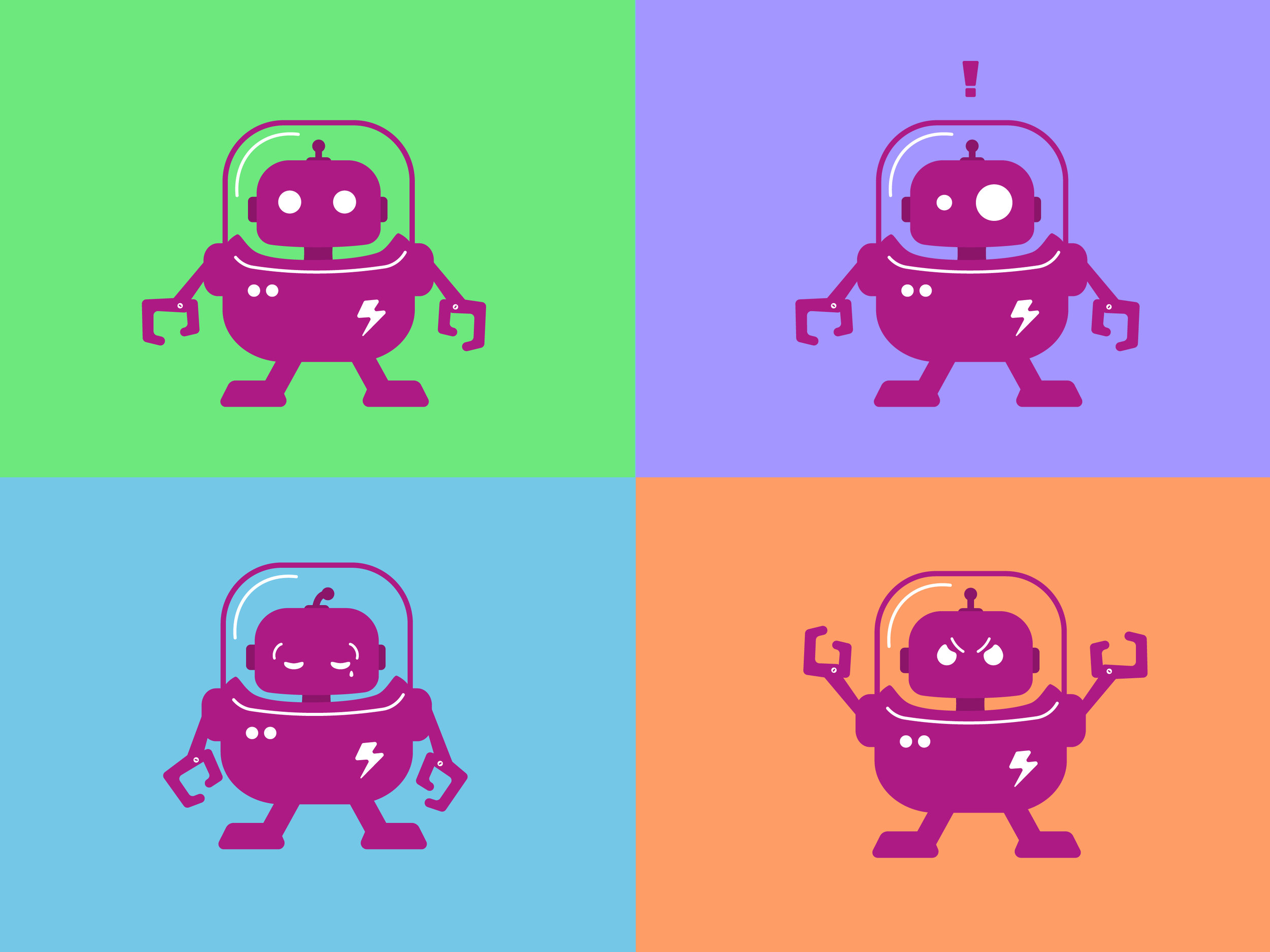
Meet Nagbot, the app you never realised you needed. Just as the name implies, this app will nag you until you accomplish whatever tasks you ask it to remind you of. In an effort to create a charismatic, but almost seemingly heartless character, this little alien-like robot was created.

scrappy /city of huntsville
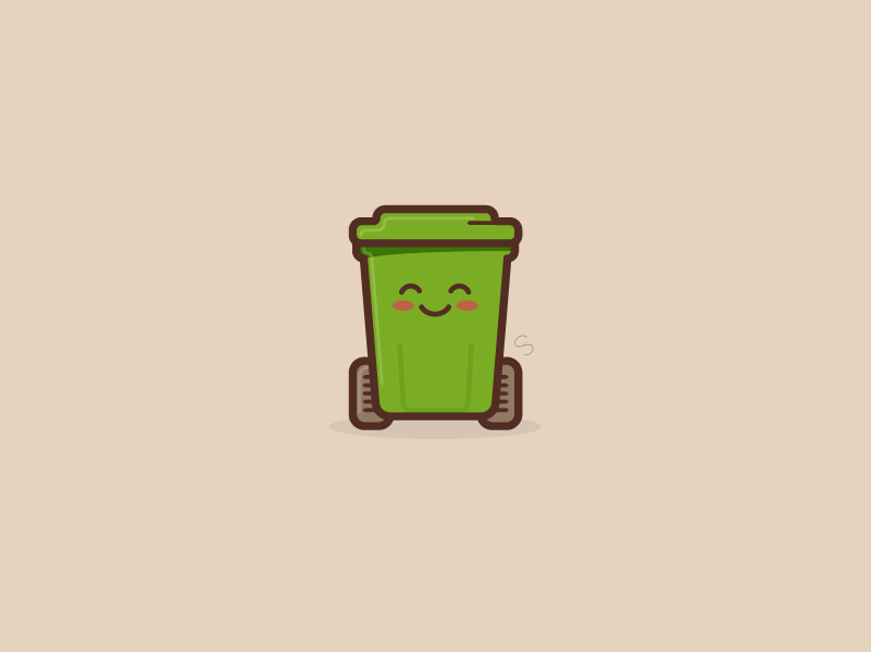
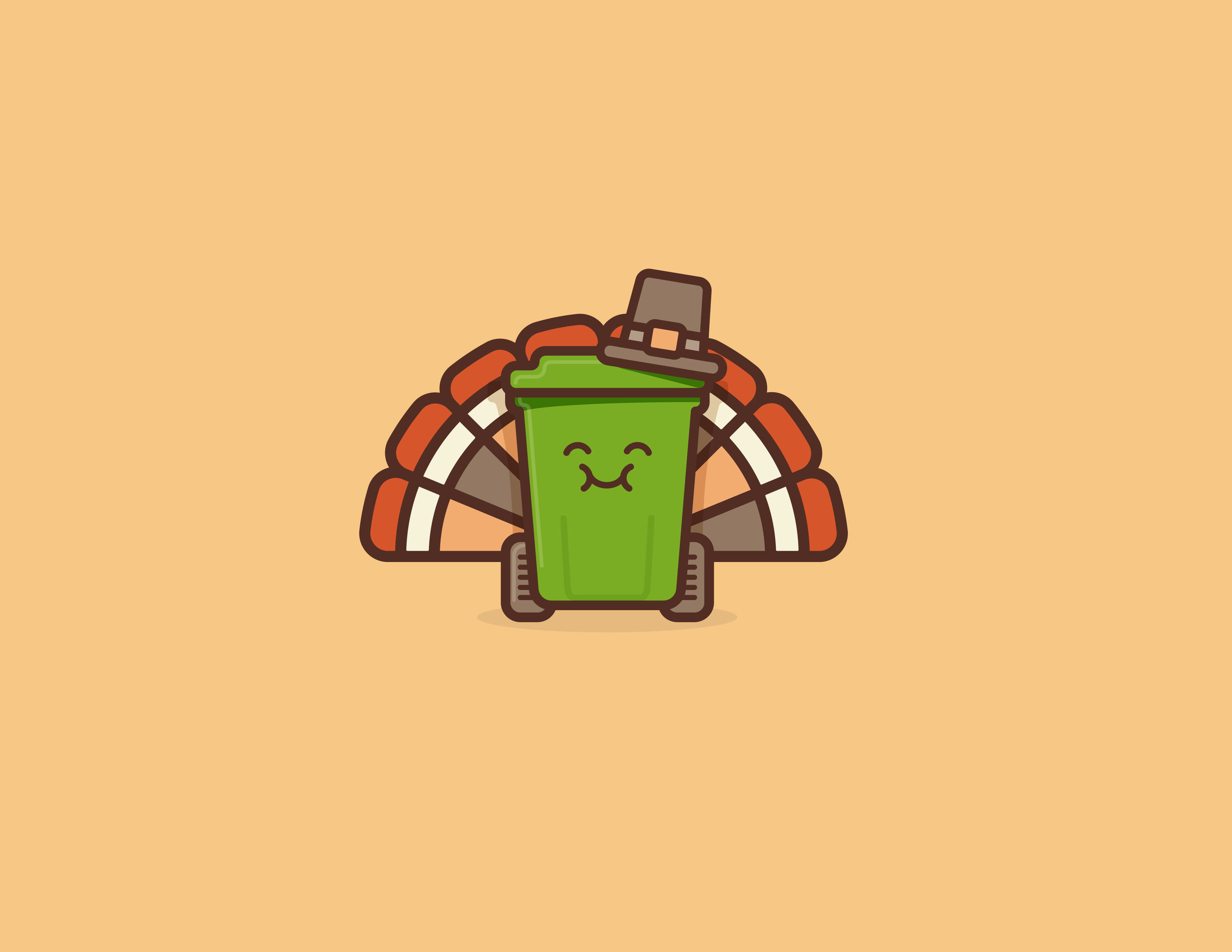
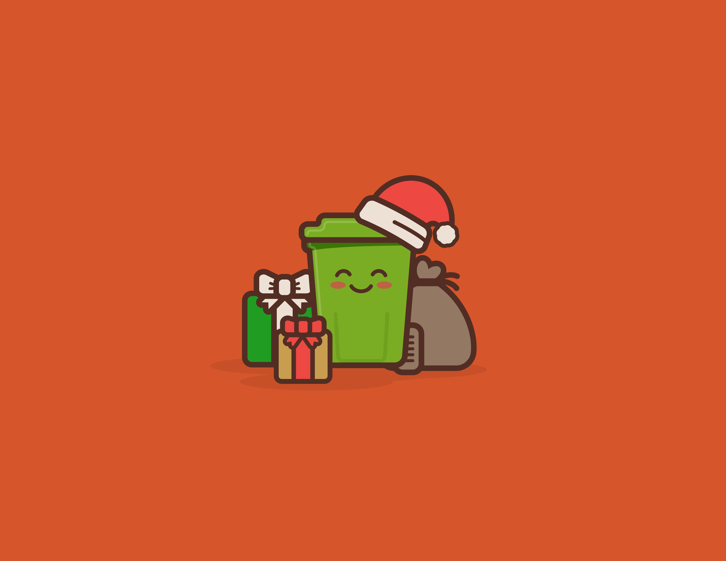
The City of Huntsville wanted to create an illustrated personification of their trashcans, in an effort to help citizens notice and pay attention to pick up delay notifications. I created the character, Scrappy, which is used throughout the year and has become an instantly recognizable presence on social media, resulting in increased awareness of announcements.
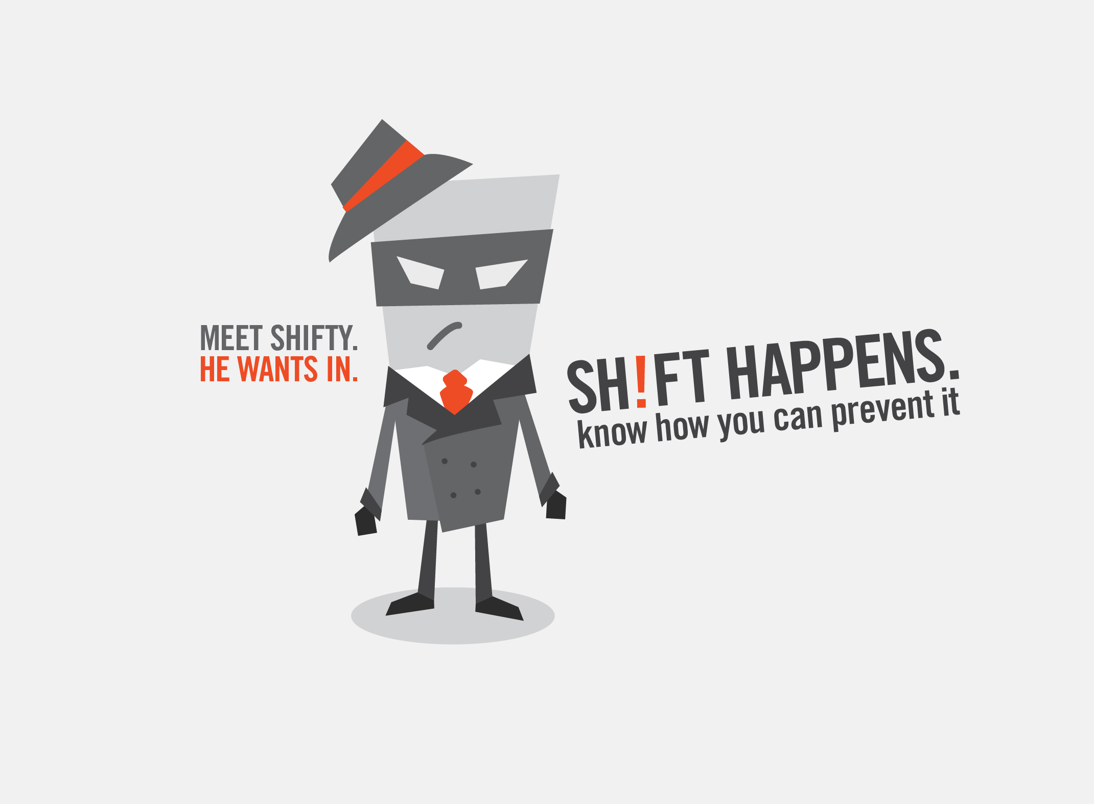
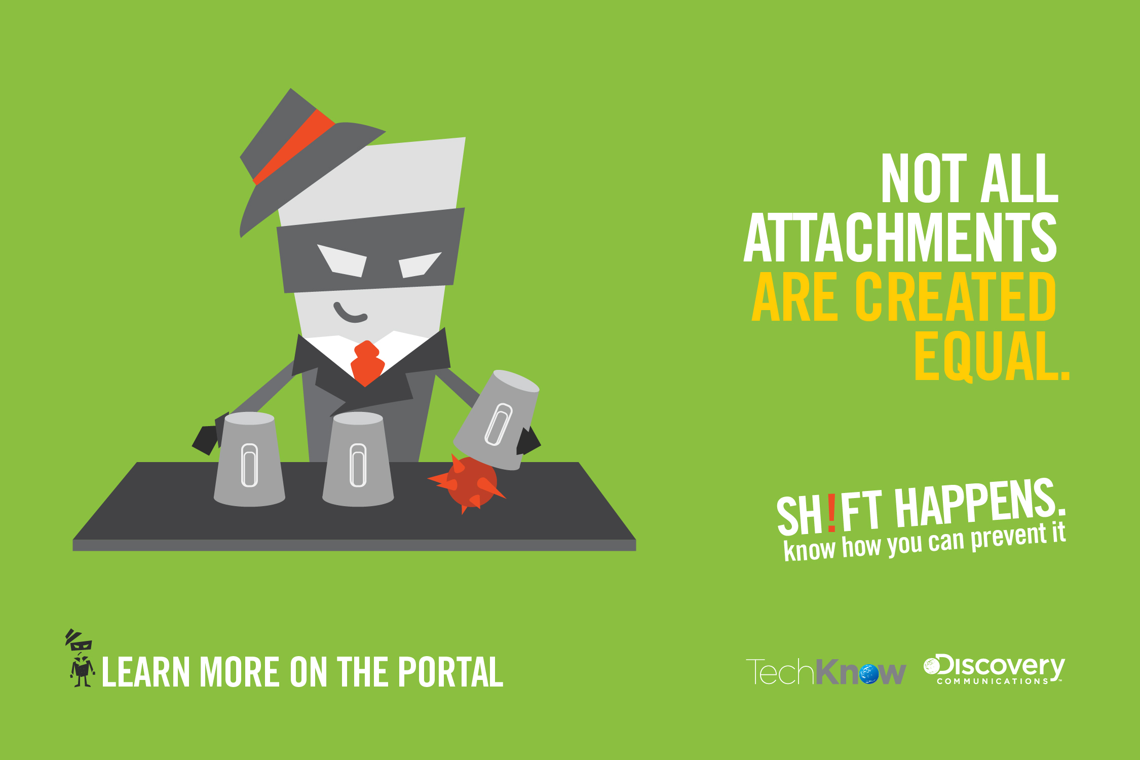
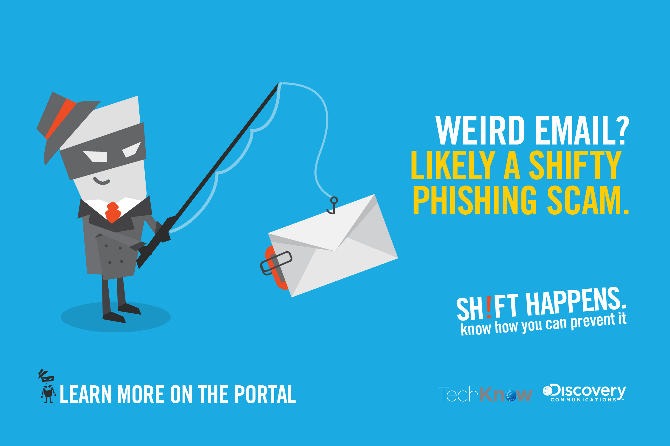
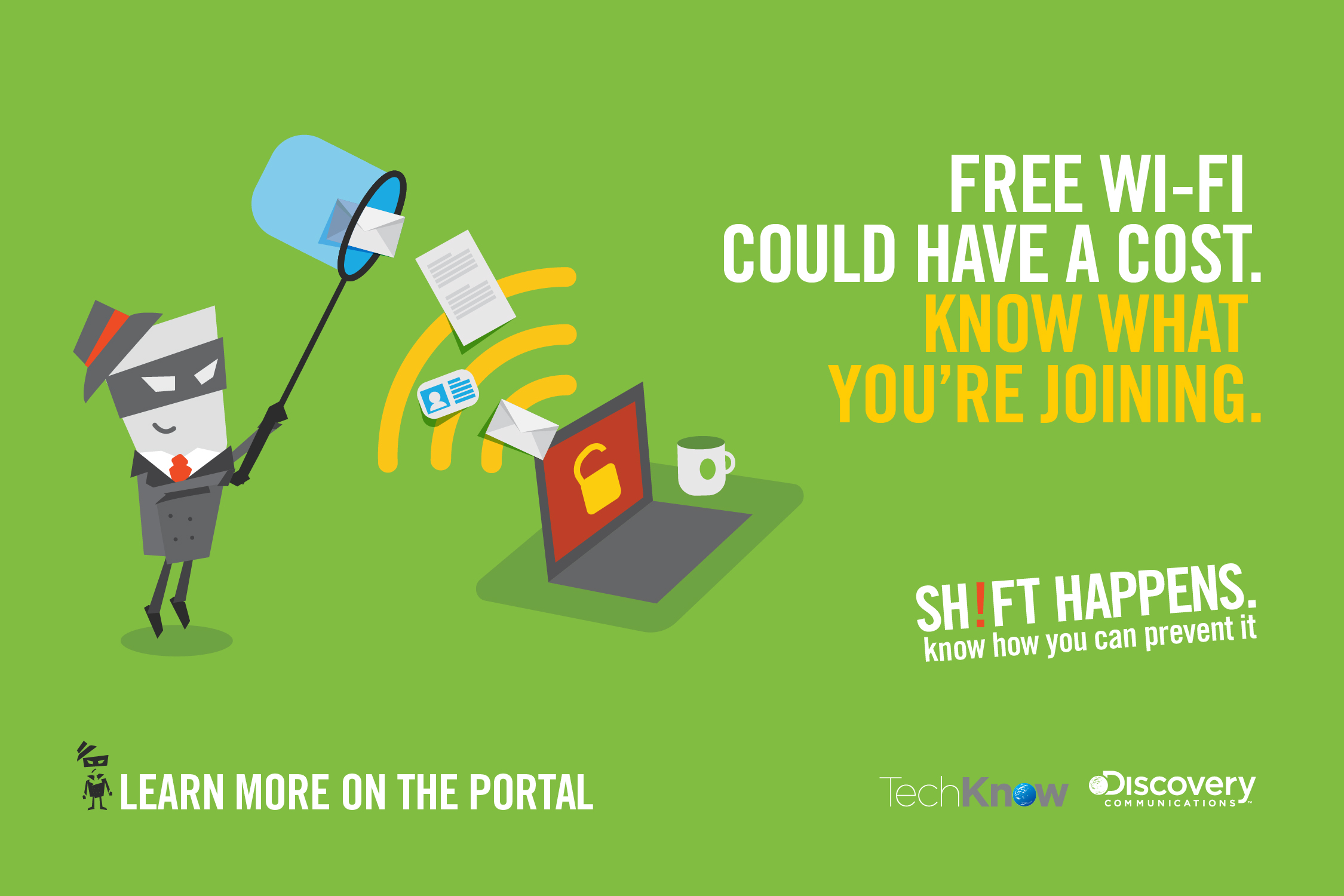
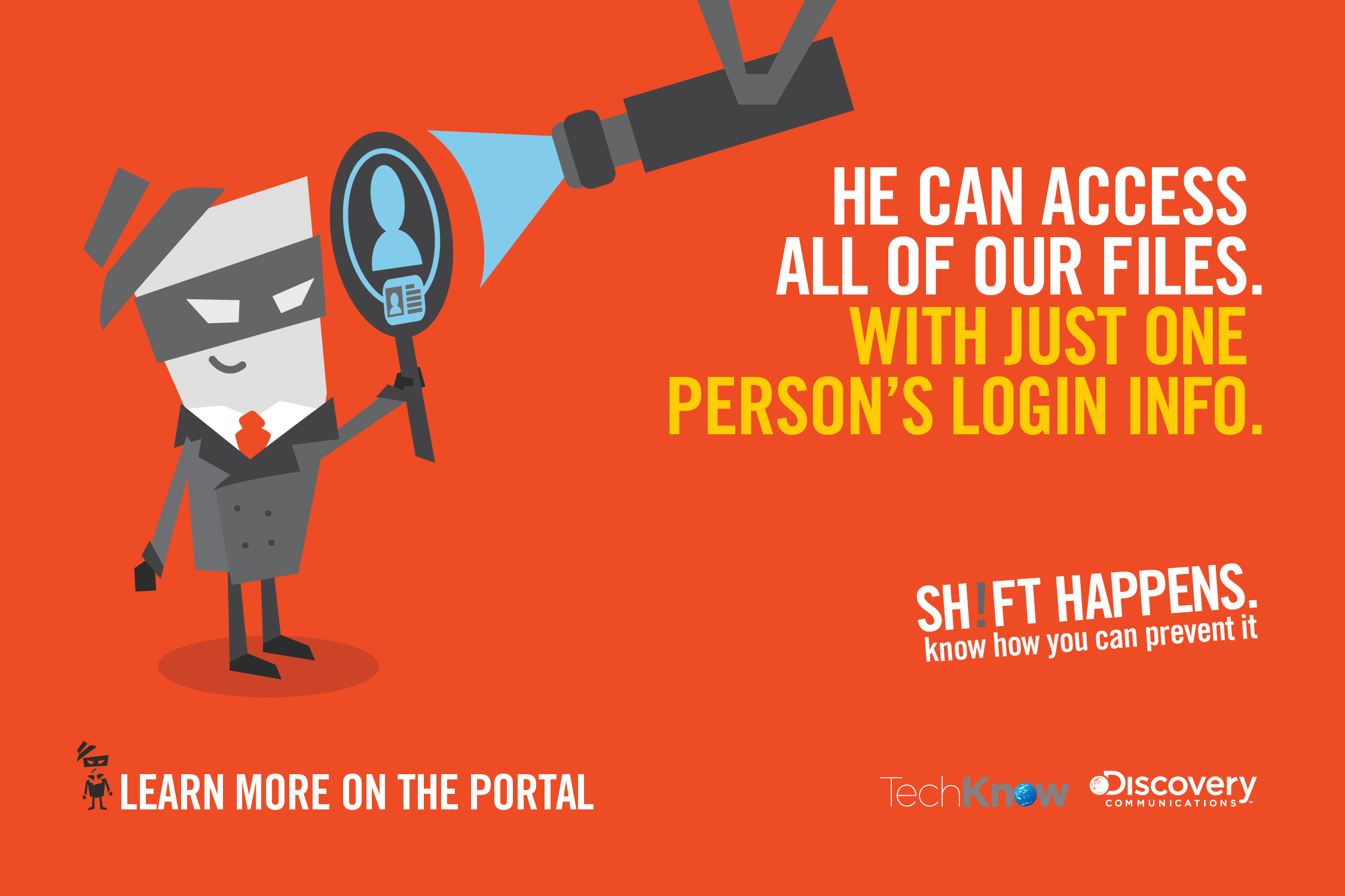
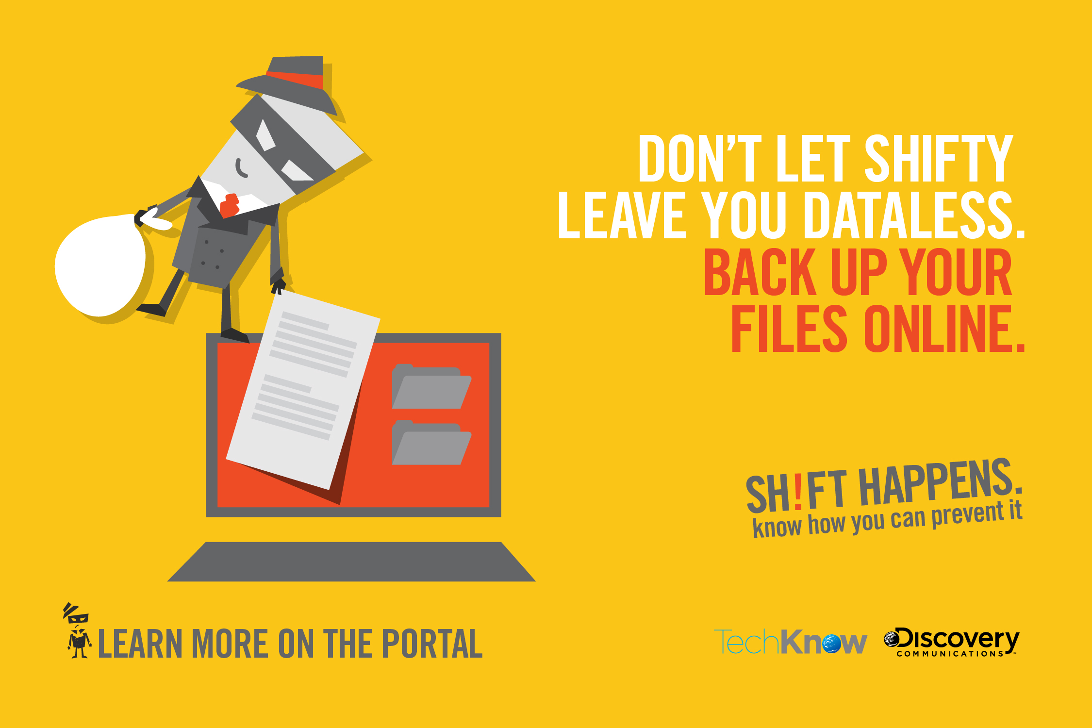
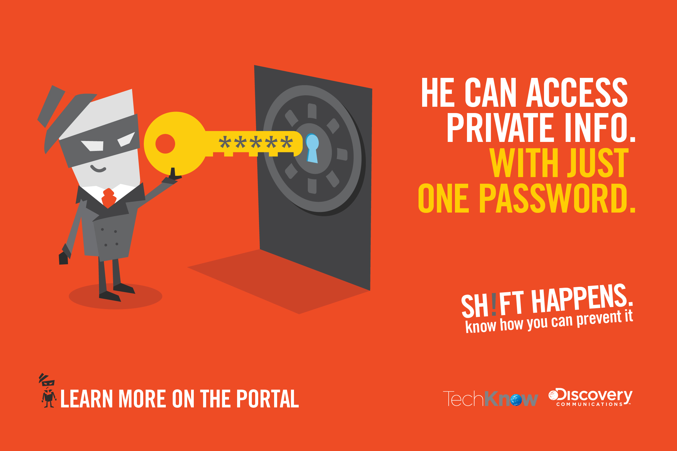
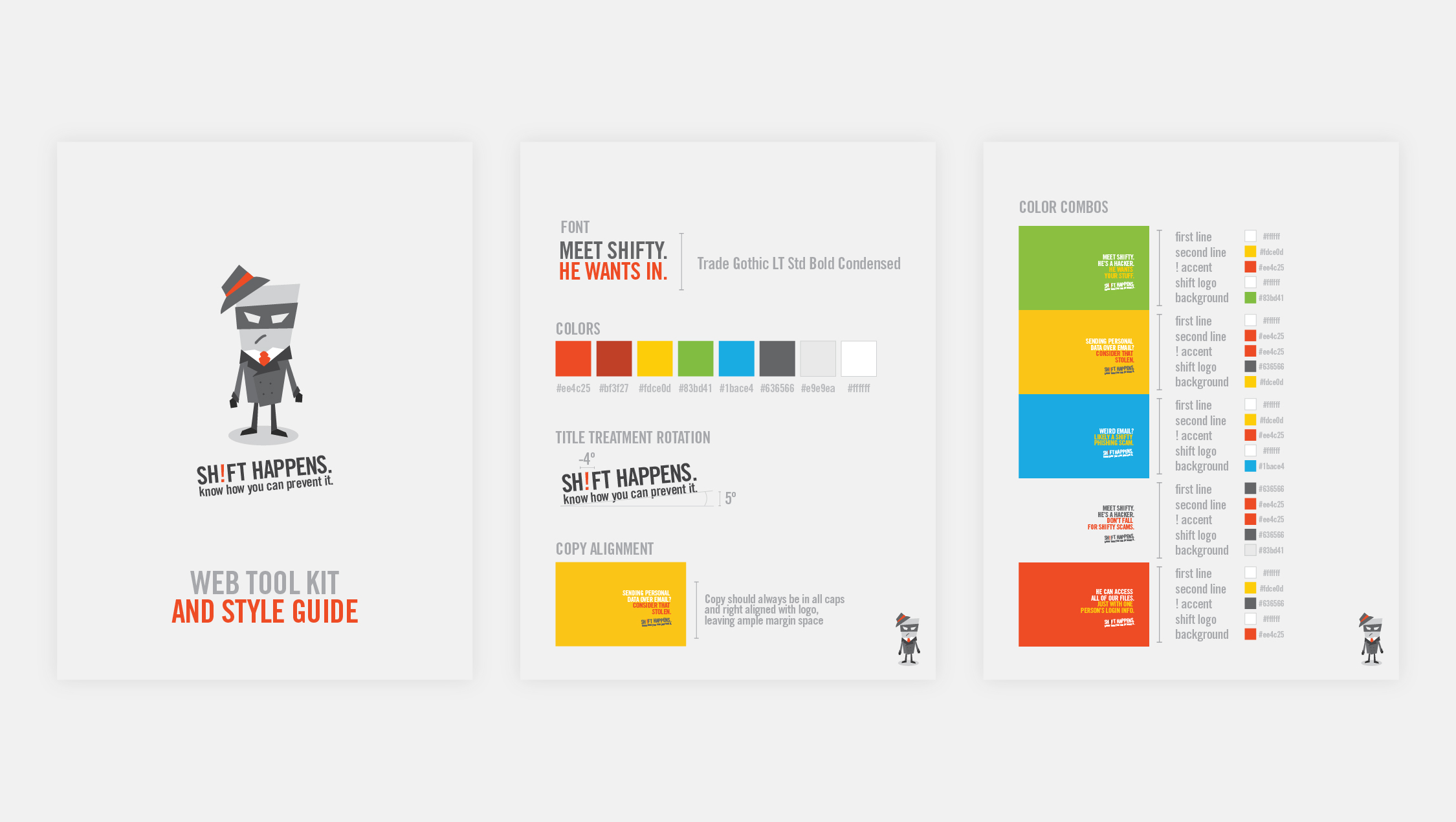
shifty /discovery communications
As a part of an IT security awareness campaign at Discovery Communications, I developed the character Shifty, who we used in various situations to explain different security risks. Shifty is a play off of the “shift” button, and when seen in full, creates an exclamation point with his shadow. The awareness campaign was highly successful, with employees across the company commenting on the different “shifty” illustrations. There was even a cardboard cut out created of him in the lobby. Sadly I don’t have any pictures of that, but was happy to hear of the numerous selfies which were taken with Shifty.
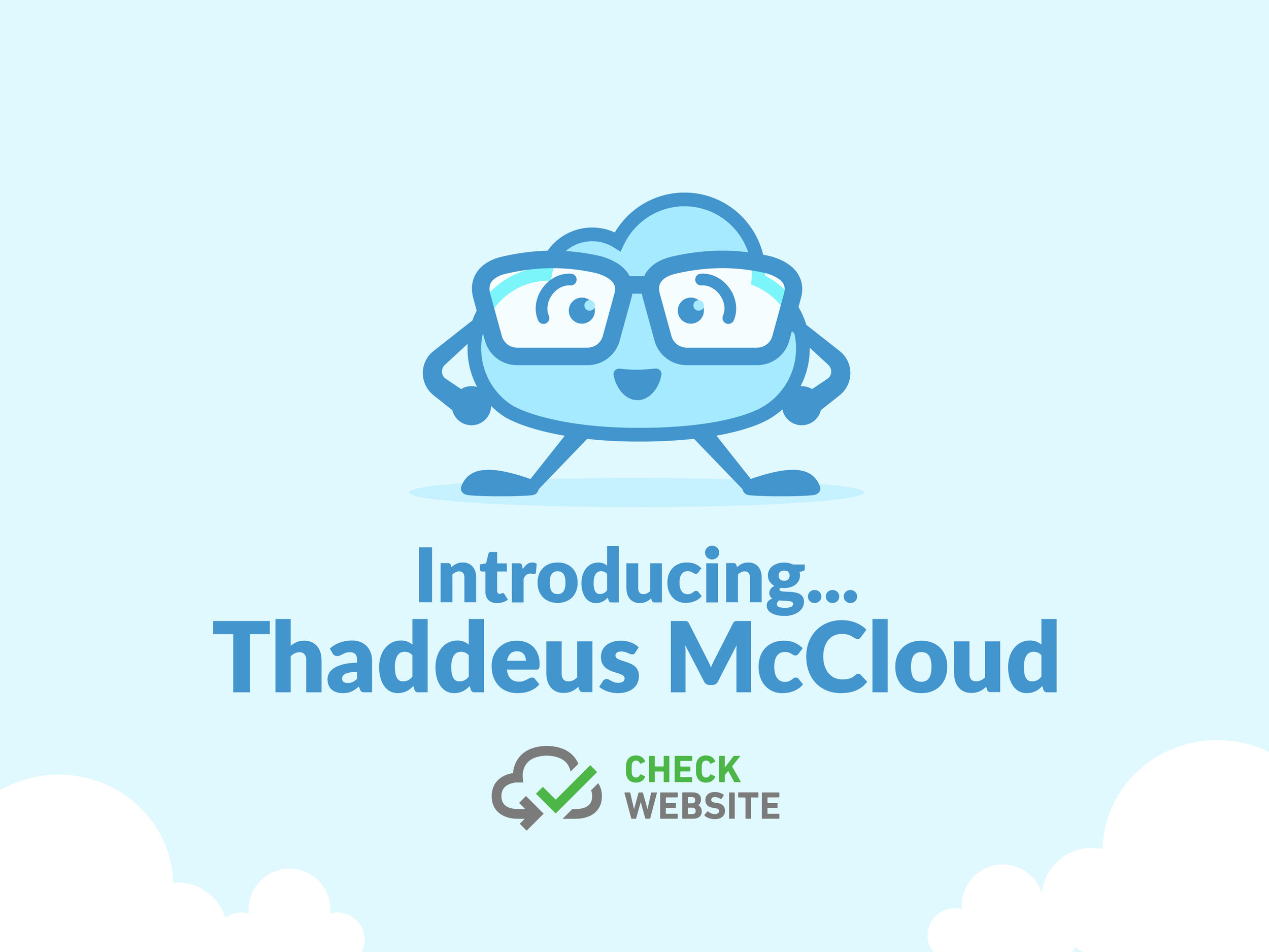


thaddeus /check website
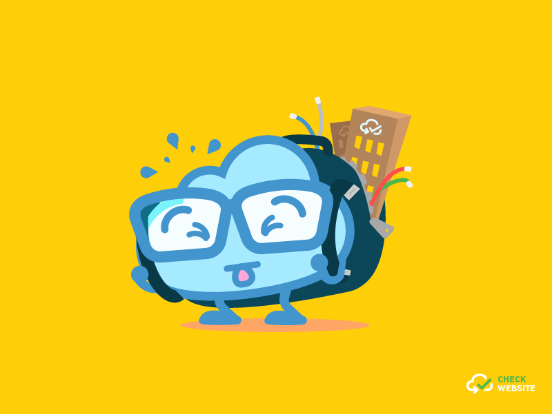
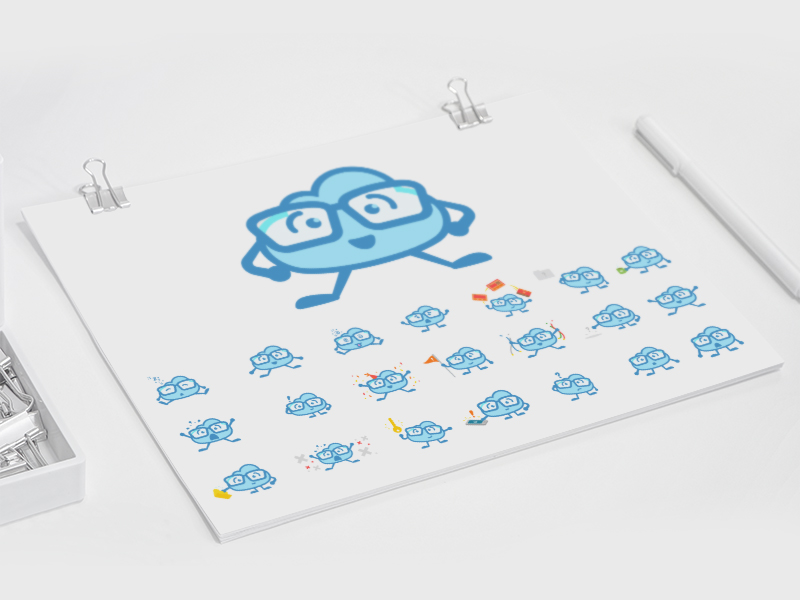
Website security can be a daunting topic, so in an effort to make the subject more approachable, the folks over at Check Website created the character: Thaddeus McCloud. The first iteration of Thaddeus wasn’t feeling charismatic enough, so they reached out to me to see if I could bring some life to their beloved character. The result is one of my favorite projects of al time. Following the make-over of Thaddeus, I created a suite of various illustrations showcasing him in different situations for the website’s blog.
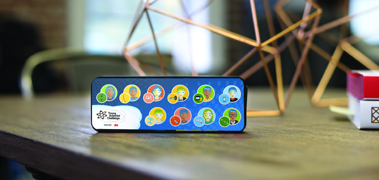
ysc challenge participants /discovery education + 3m
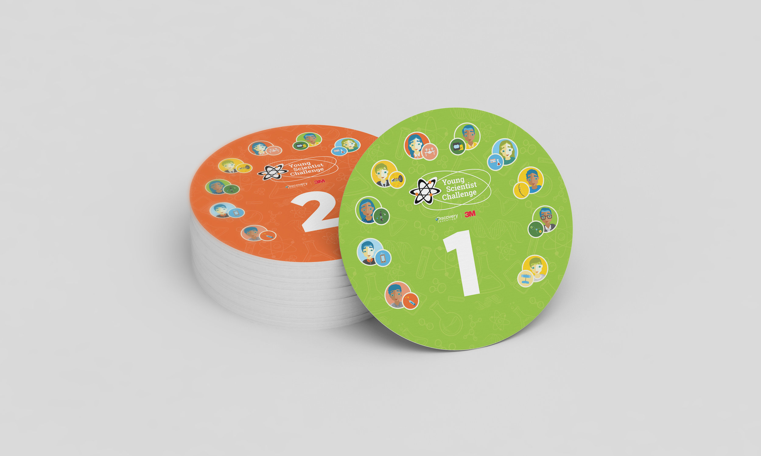
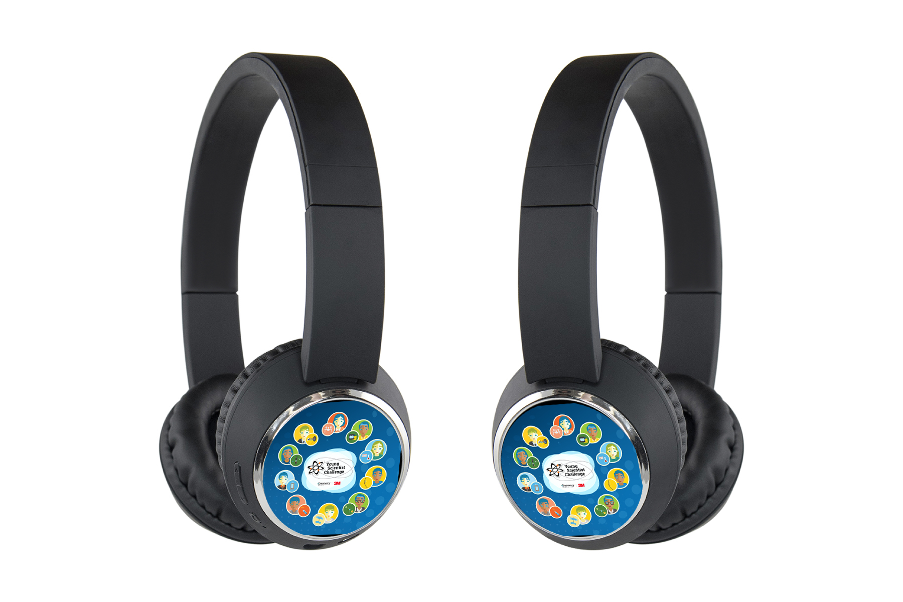
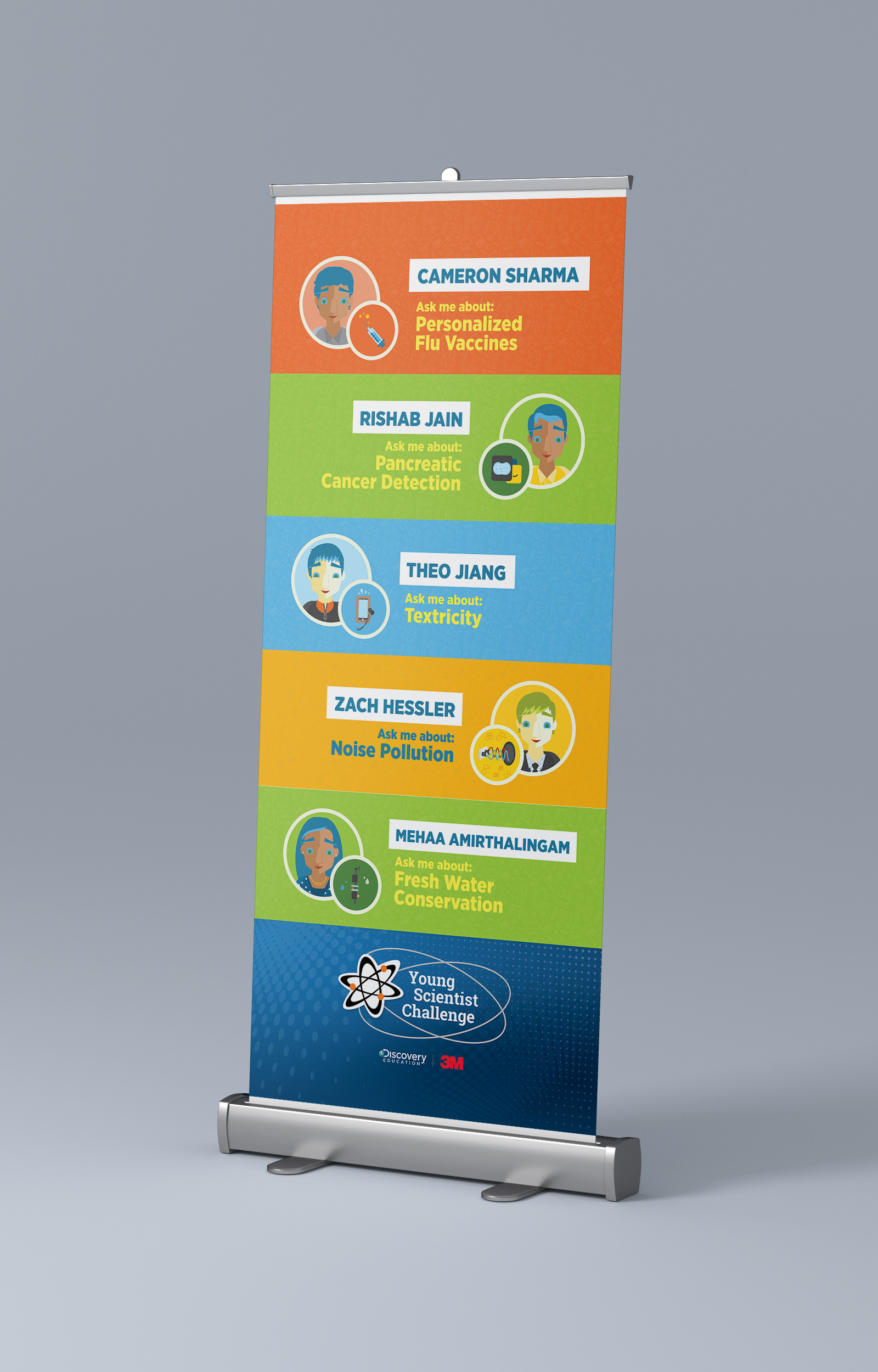
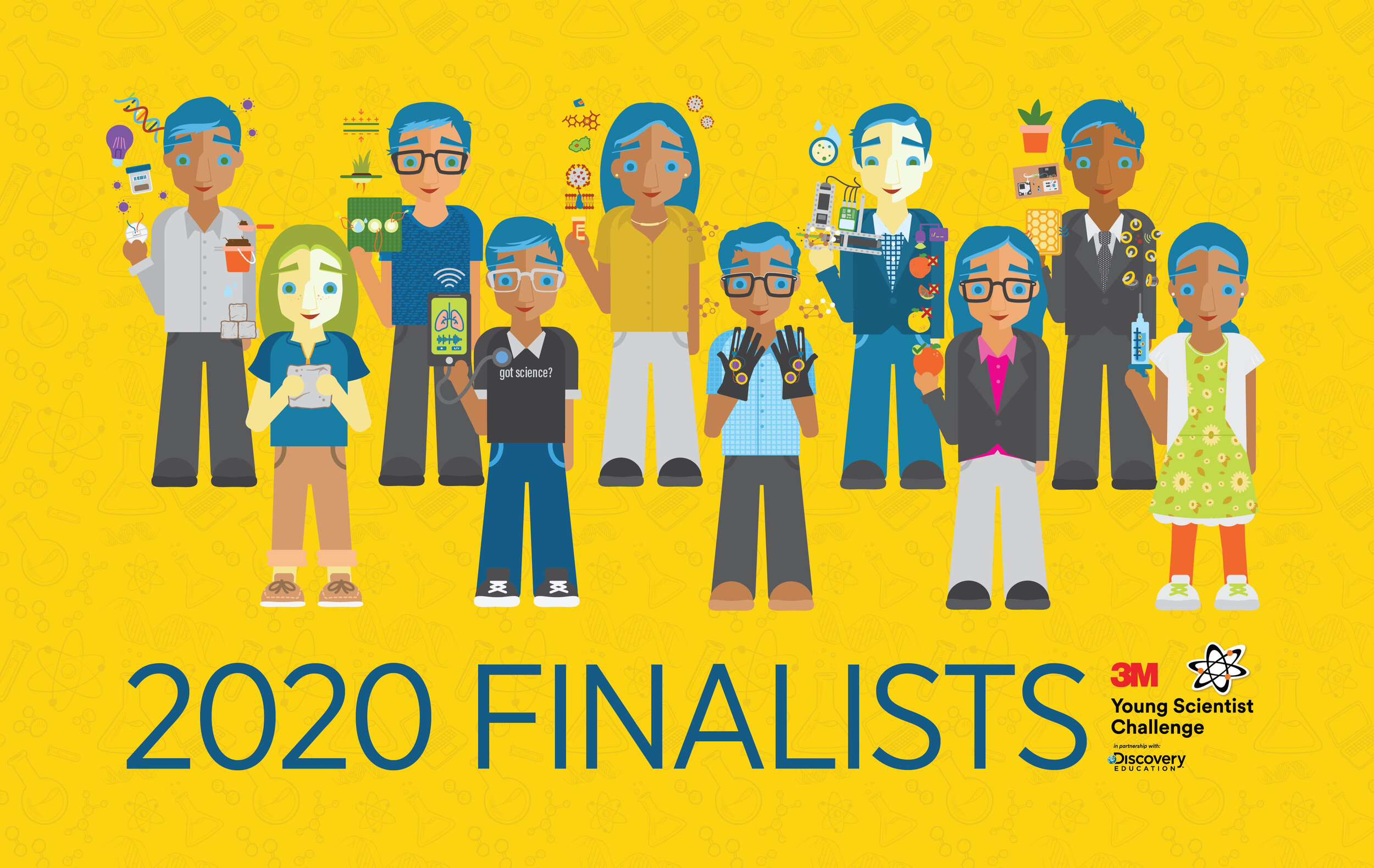
Starting in 2015, I have had the absolutely privilege of illustrating the 10 finalists of the Discovery Education + 3m Young Scientist Challenge. Not only was it an exciting brief, but learning about the different projects these young students had worked on was both incredibly inspiring and humbling. There were projects ranging from water filtration, to cancer treatments, to archery for the blind. Year after year, I looked forward to the opportunity to work on this project, and I continue to wish these students all the best in their scientific careers.


